#F6F3EC
PK-001 · Whites & Off-WhitesLight Tone
Warm White
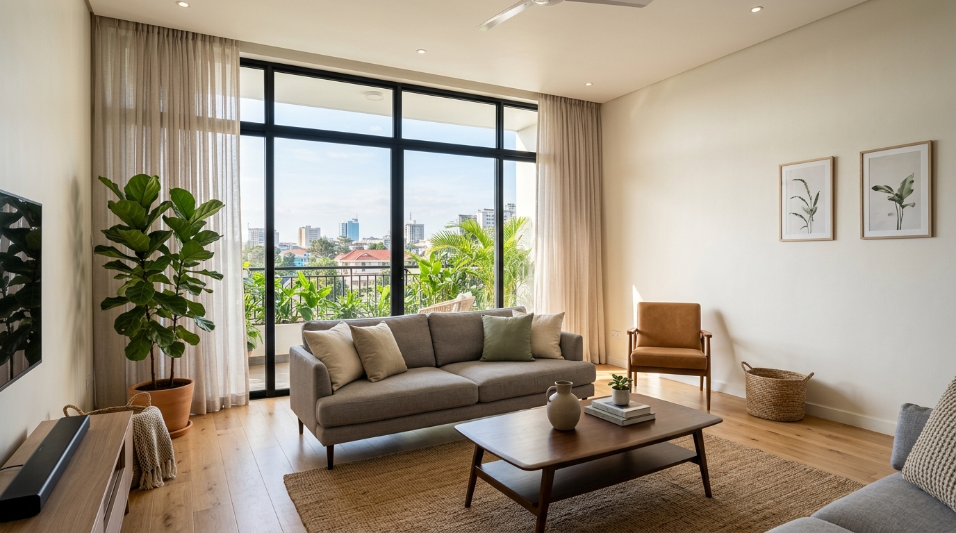
Soft off-white with a gentle creamy base. Ideal for living rooms and bedrooms seeking a warm, welcoming light without turning yellow.
Interior & ExteriorView Shade

100 architectural paint shades across 10 colour families. Calibrated for Kenyan natural daylight and computer-tinted on demand in Nairobi into Crown Paints, Duracoat, and Plascon bases.
Soft off-white with a gentle creamy base. Ideal for living rooms and bedrooms seeking a warm, welcoming light without turning yellow.
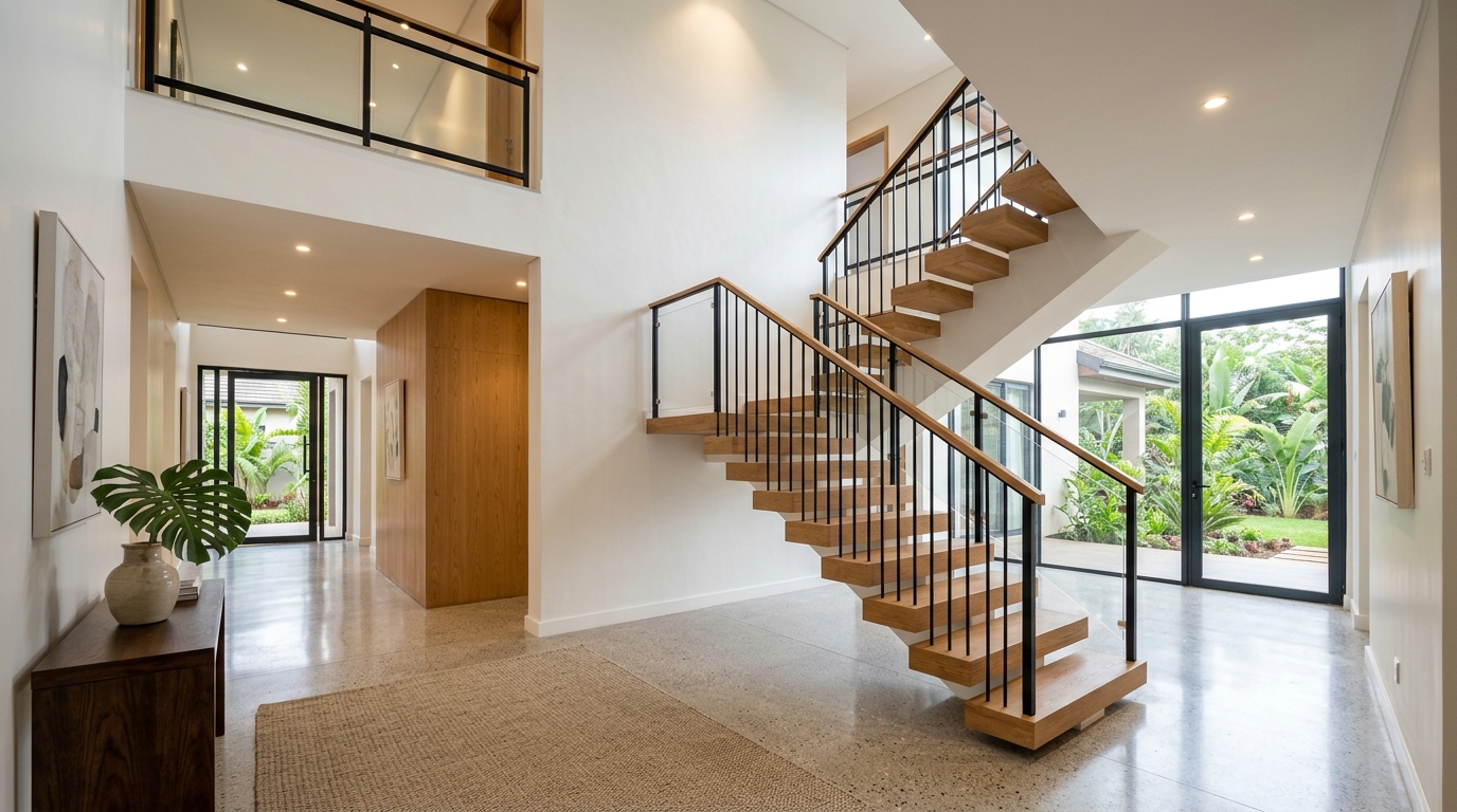
Balanced neutral white with zero stark glare. Works effortlessly across open-plan living areas, corridors, and ceilings.
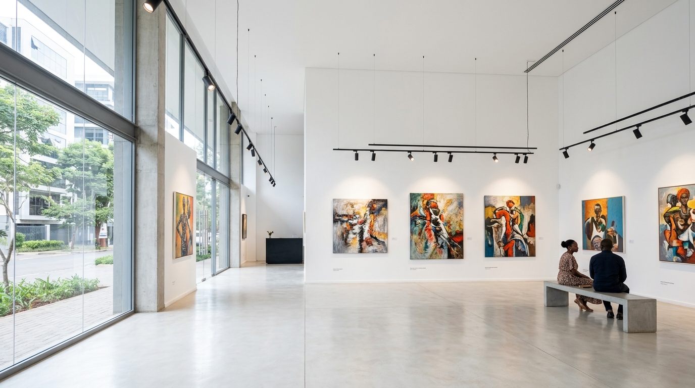
Crisp architectural white with maximum light reflection. Best for trims, ceilings, modern retail galleries, and minimalist interiors.
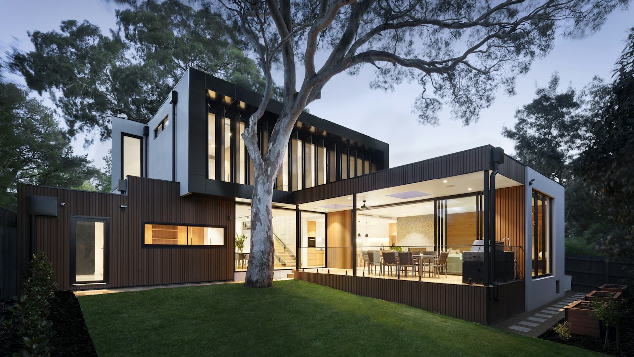
Classic ivory off-white that adds warmth to traditional dining rooms and formal lounges without feeling overly heavy.
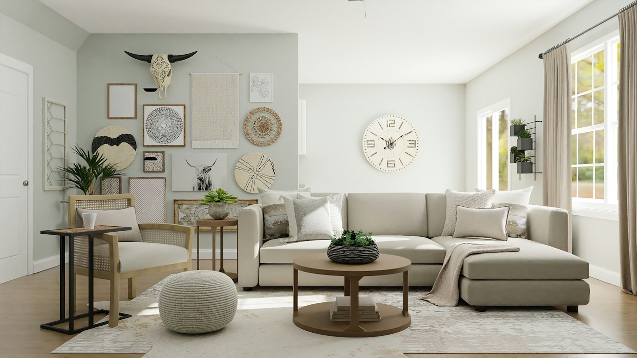
Rich, comforting white with a gentle cream base. Excellent for bedrooms and family rooms that need a cozy, relaxing ambiance.
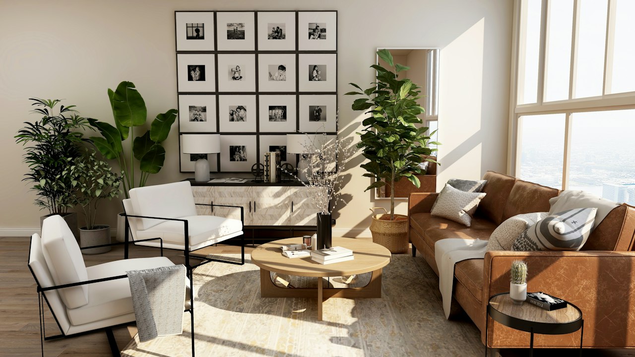
Muted, parchment-toned off-white that pairs gracefully with natural stone finishes, exposed brickwork, and rustic timber.
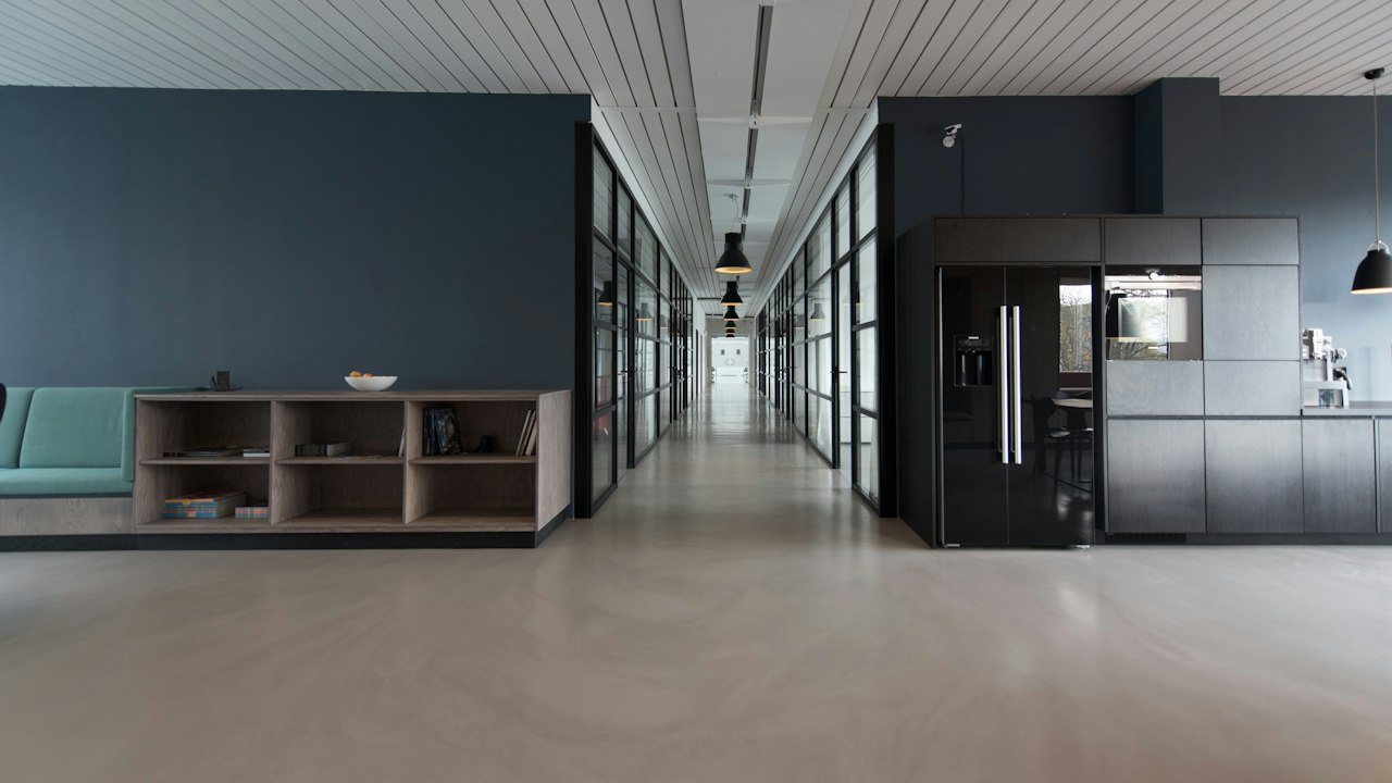
Crisp, contemporary white with a slight cool cast. Popular in modern urban apartments and commercial executive suites.
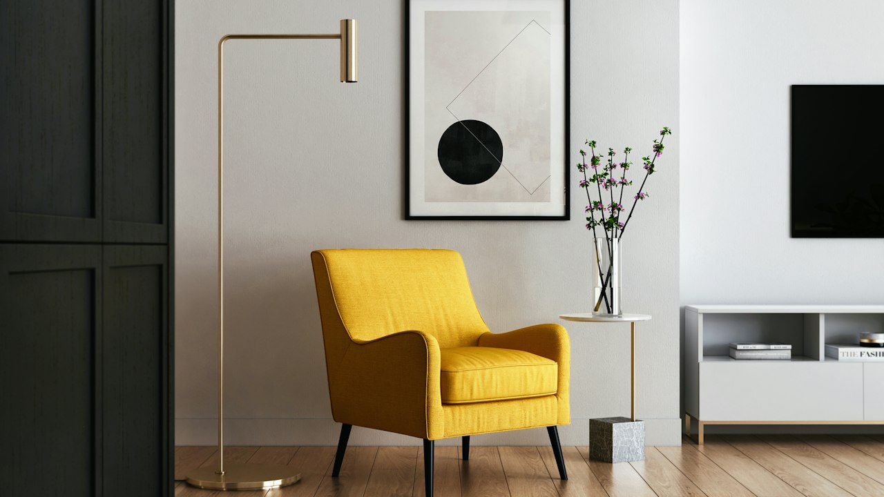
Natural textile-inspired off-white. Offers a relaxed, sophisticated neutral base for open-plan homes and boutique guest suites.
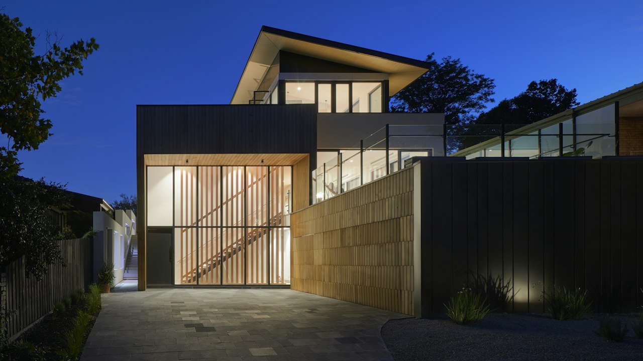
Fresh, clean white with smooth coverage. Specially recommended for kitchens, bathrooms, and corridors needing a bright, hygienic look.
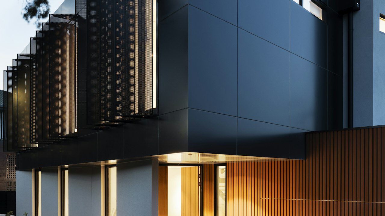
Pale mineral white with gentle masonry depth. A dependable choice for exterior facades and boundary walls that resist airborne dust.
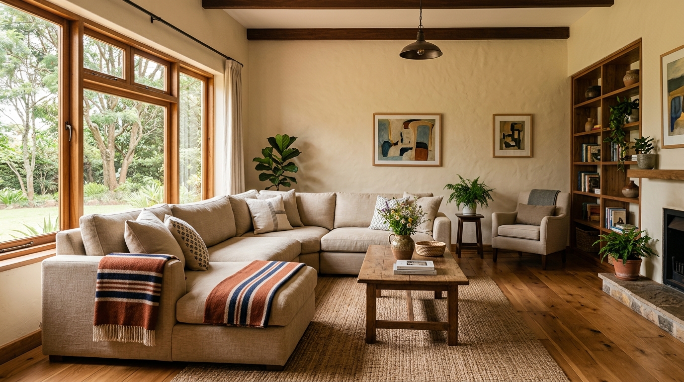
Comfortable, sunny cream shade. Brightens south-facing rooms and corridors that receive indirect natural light.
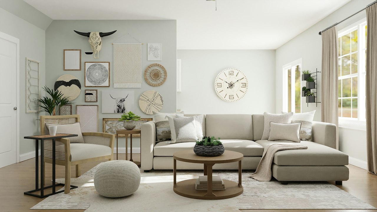
Very light cream that gives walls a softer feel than stark white without darkening the room.
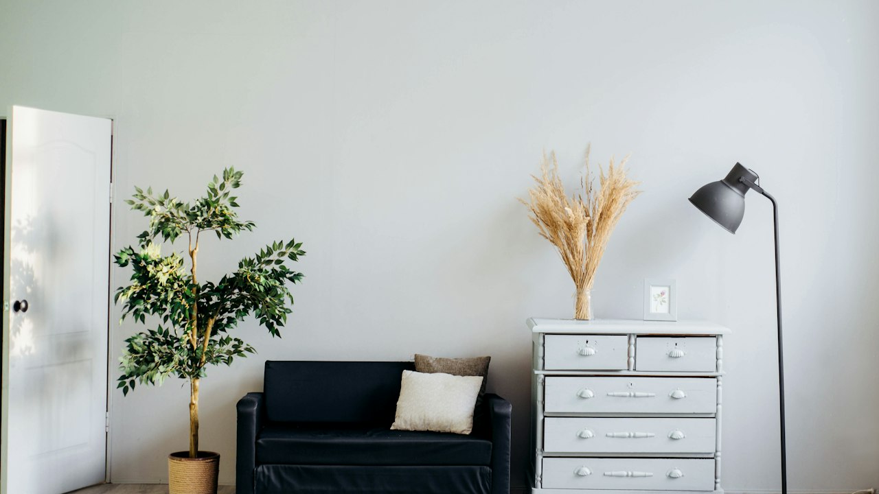
Familiar, trusted cream color popular across residential developments and suburban family homes throughout Kenya.
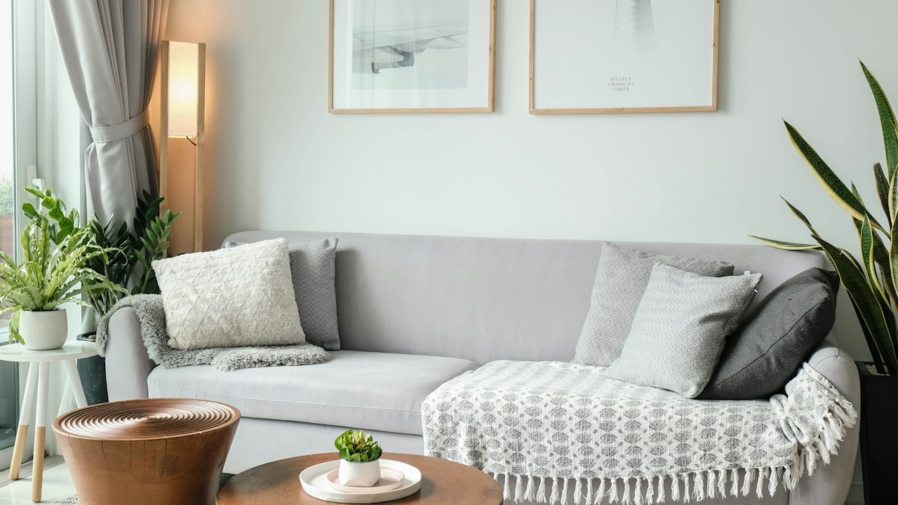
Luminous cream that adds cheerful radiance to breakfast areas, verandas, and family lounges.
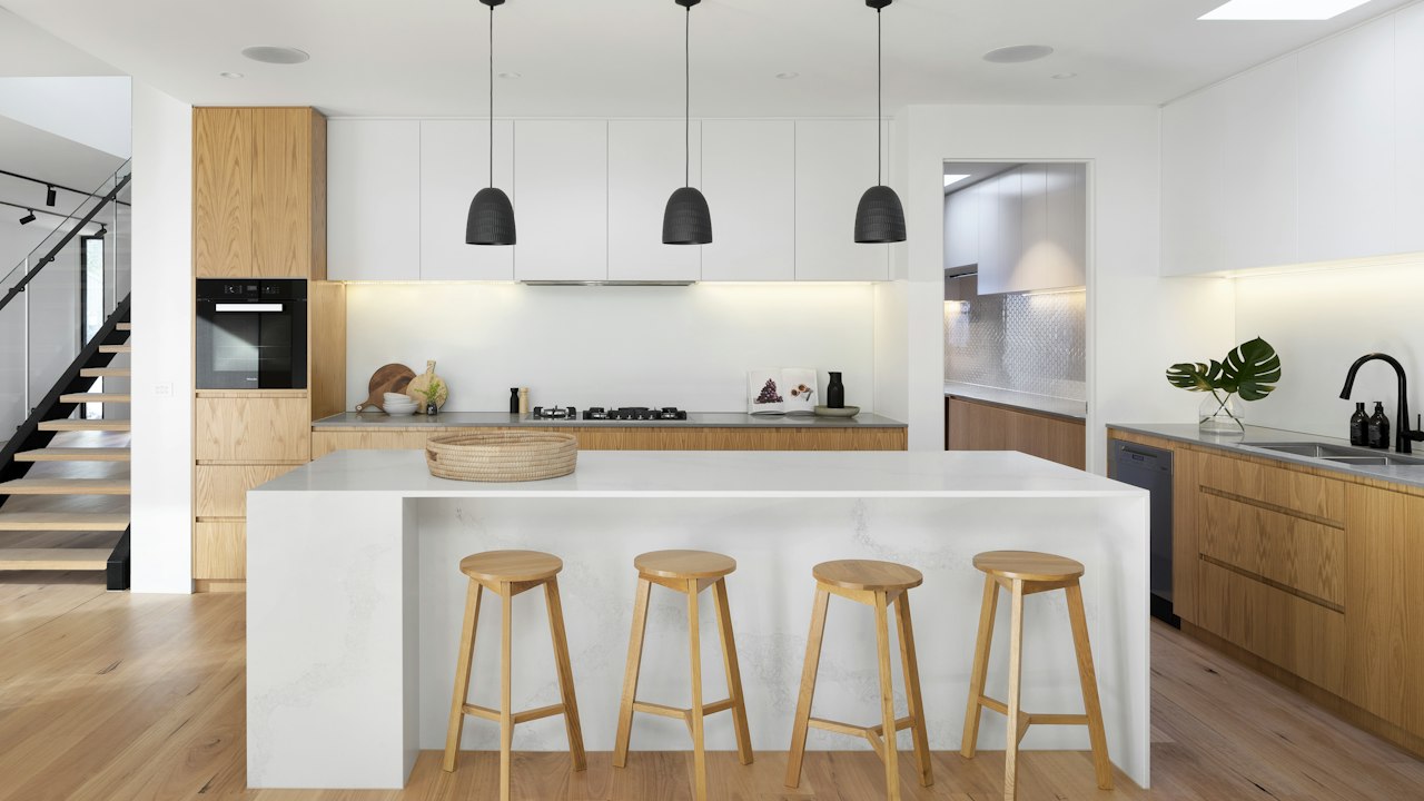
Modern oat-toned neutral. The quintessential versatile wall shade for rental developments and contemporary homes.
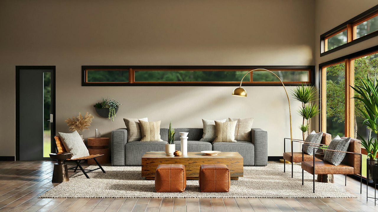
Comfortable, grounded beige. Adds tactile depth to living rooms and master suites while masking everyday household wear.
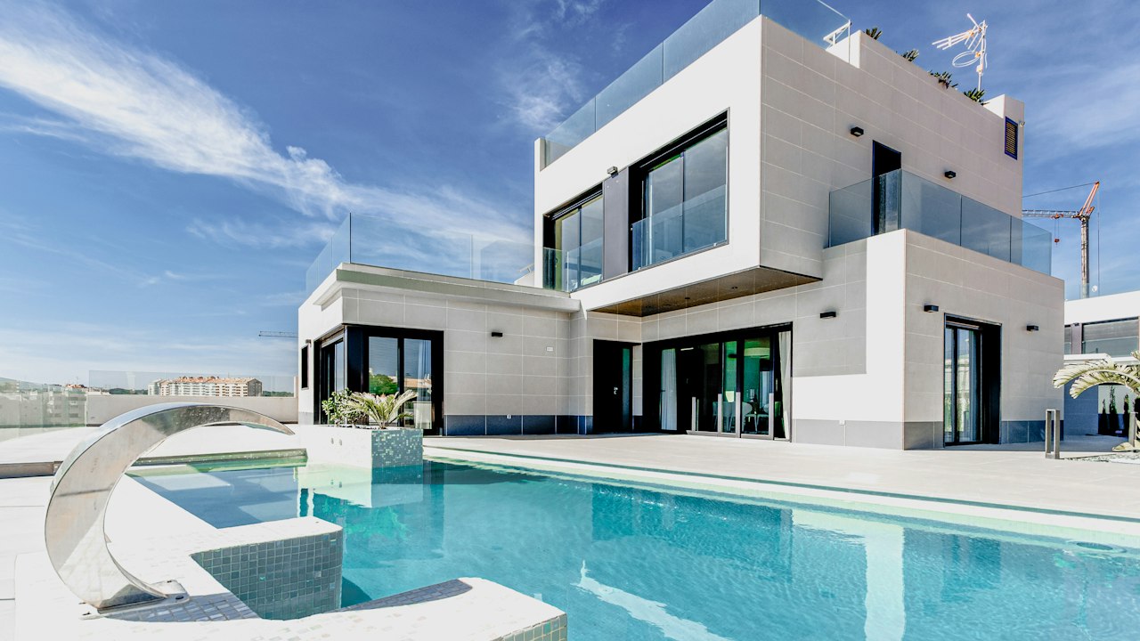
Durable sand shade suited for both coastal and upcountry properties. Highly effective on exterior facades and high-traffic areas.
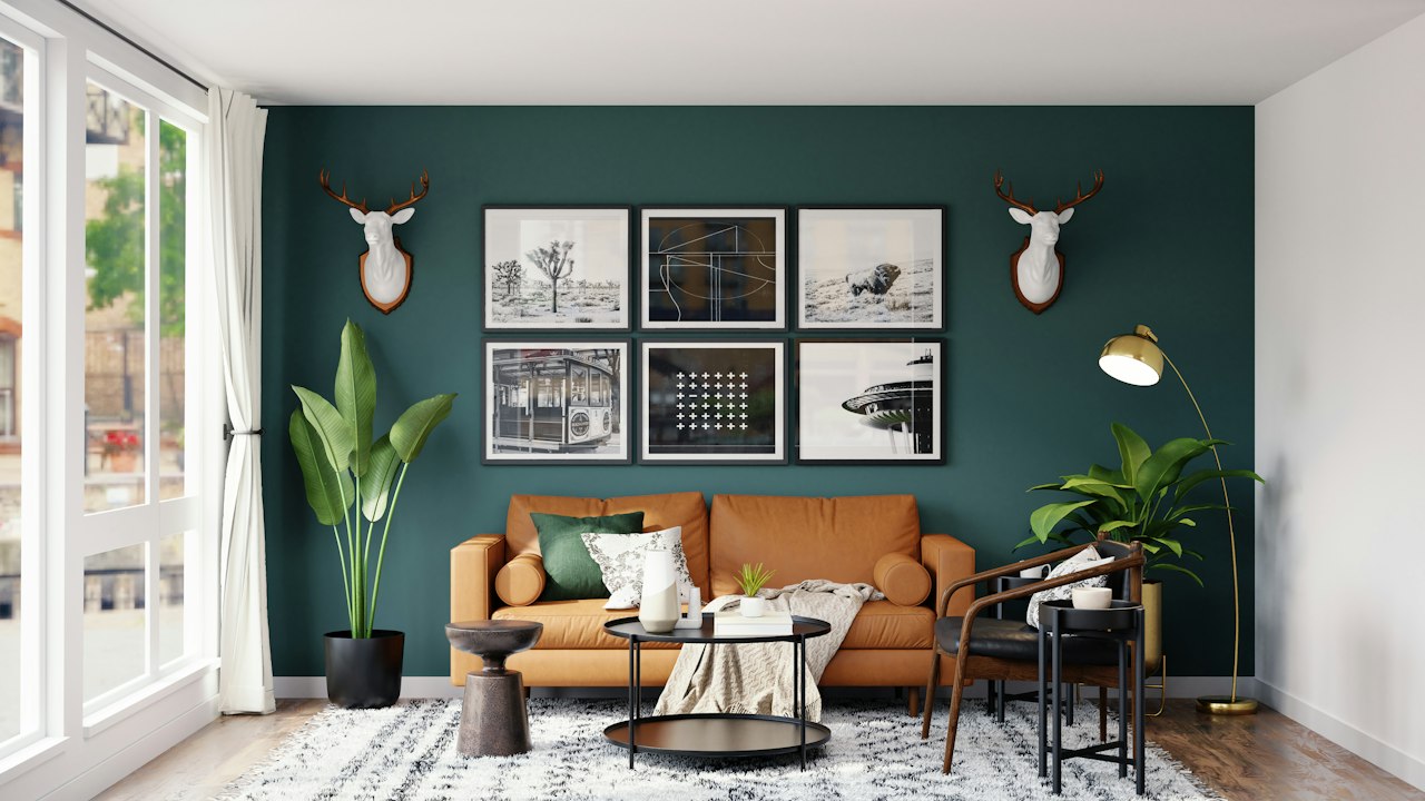
Earthy, organic beige that harmonizes with woven textures, indoor greenery, and natural stone flooring.
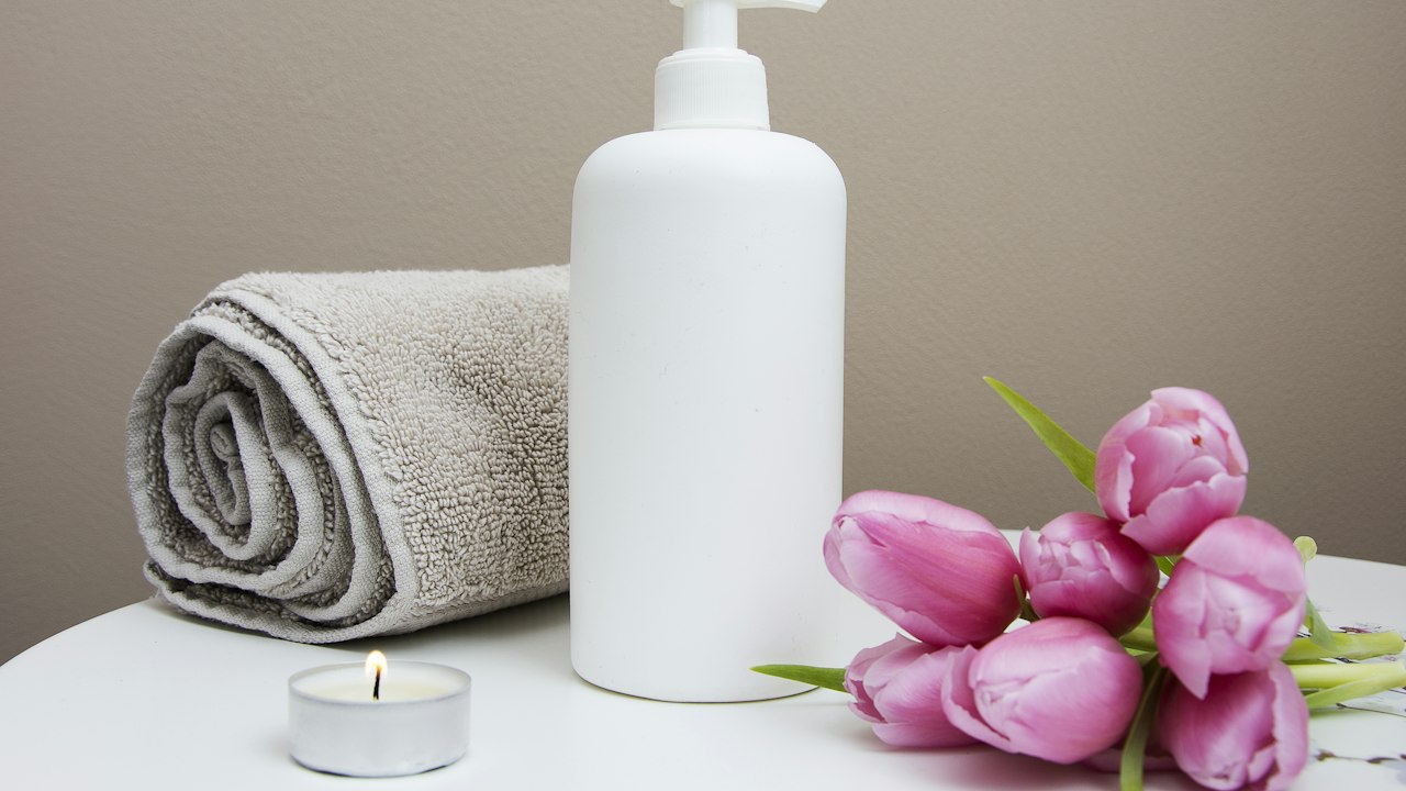
Sophisticated greige shade. Provides a calm, contemporary backdrop for modern offices, apartments, and boutique retail stores.
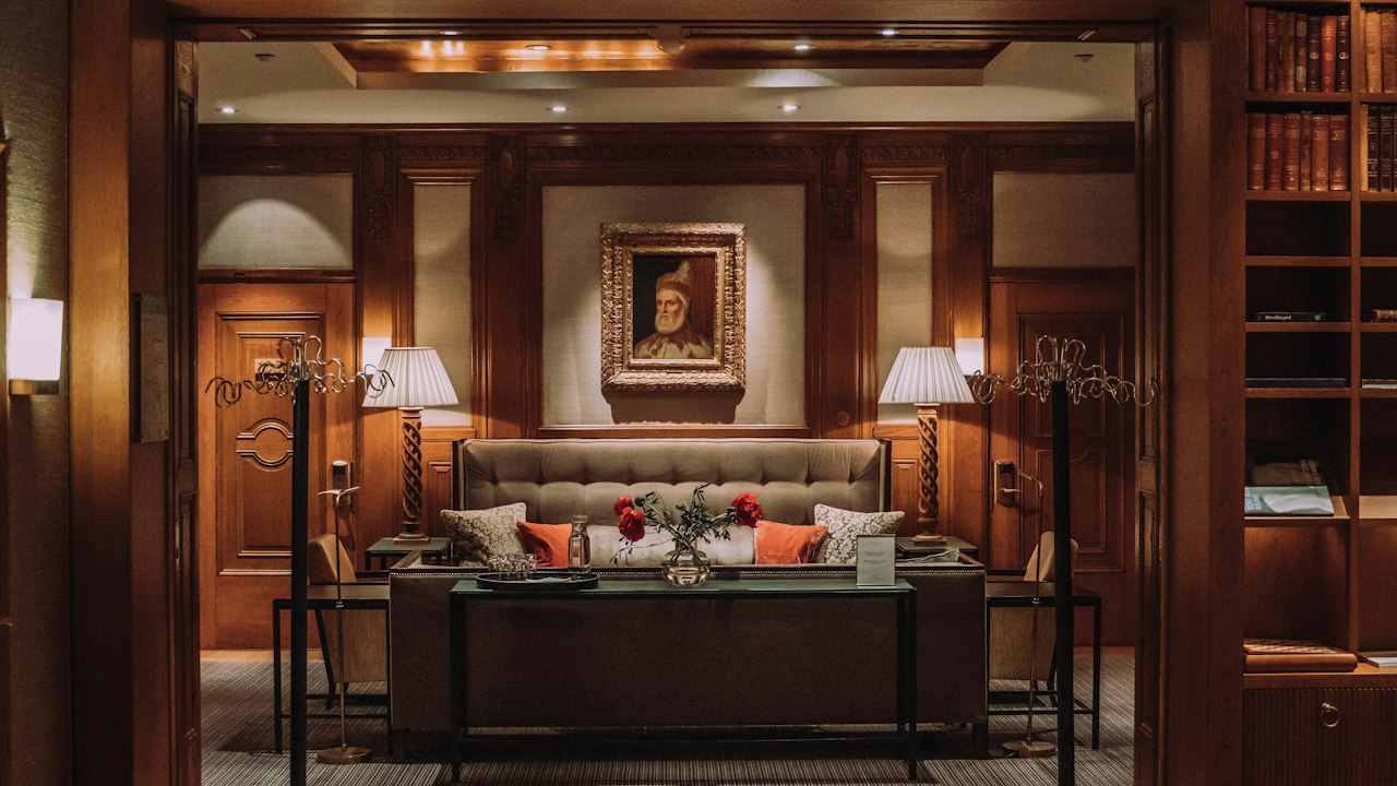
Rich greige that delivers cozy architectural substance to large living rooms, staircases, and hotel reception areas.
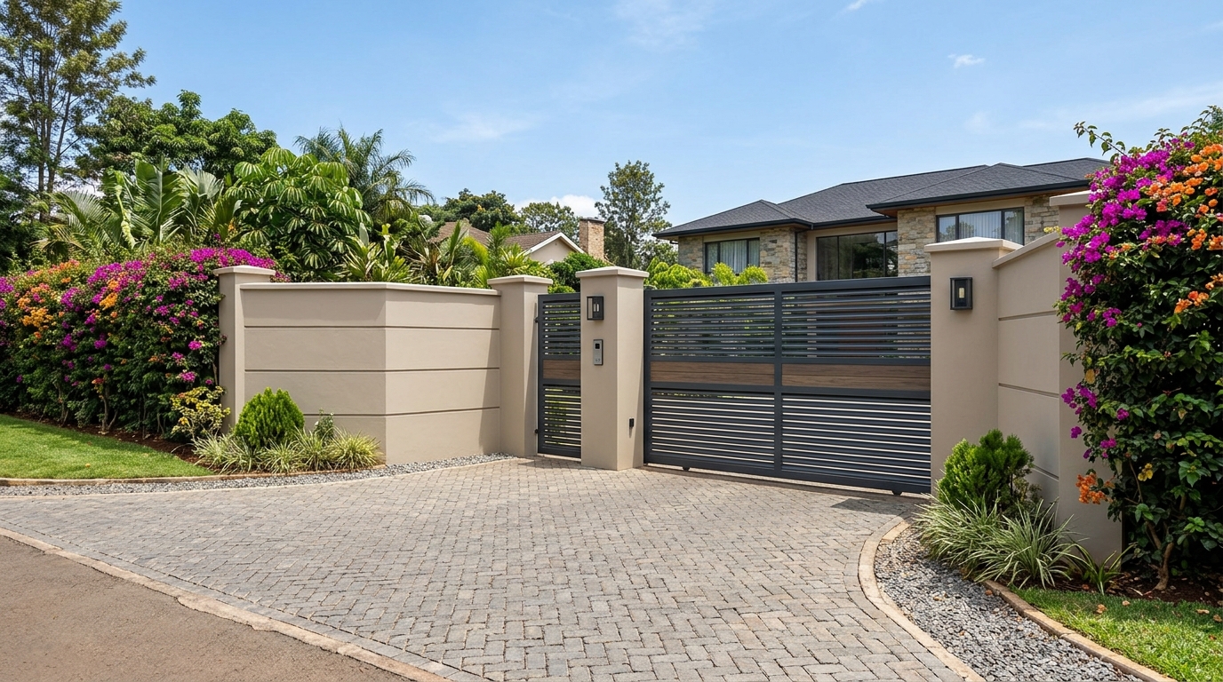
Weathered sandstone beige. Excellent for exterior residential render, boundary walls, and covered verandas.
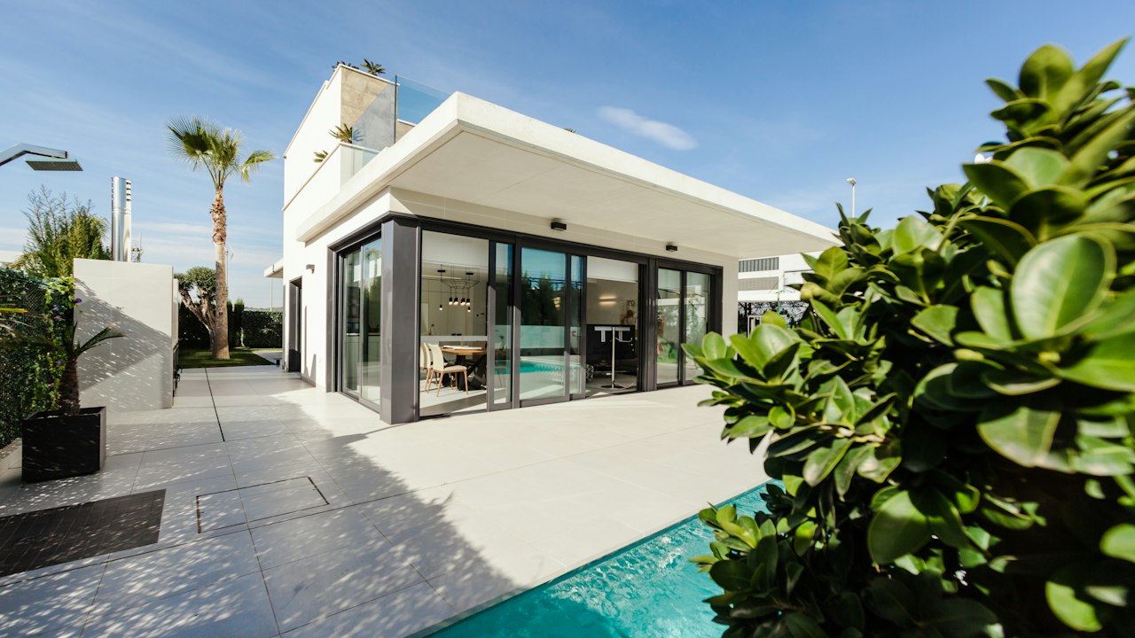
Sun-baked golden sand tone. Blends effortlessly into East African landscapes, making it ideal for lodges, perimeter walls, and rural residences.
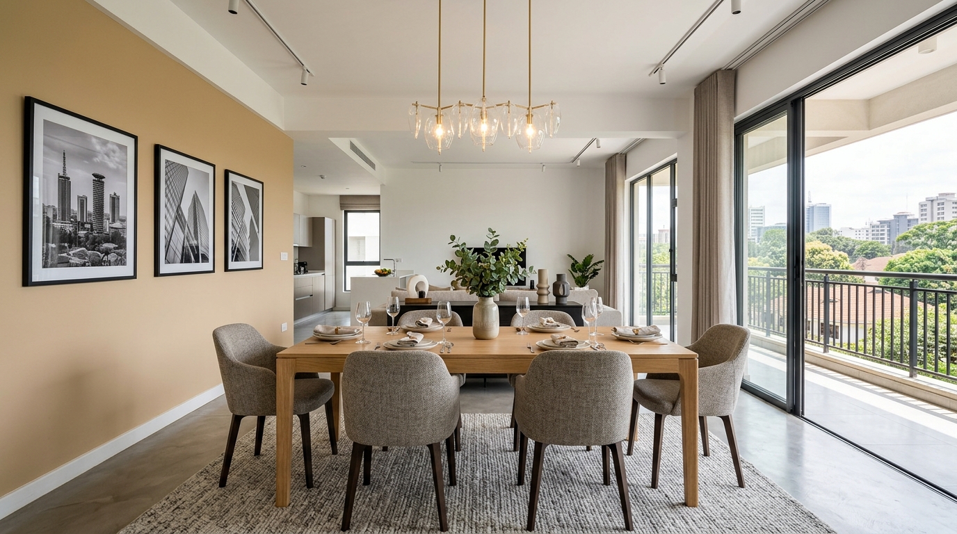
Comfortable, creamy nut beige. Creates an inviting, sociable environment in dining areas and family lounges.
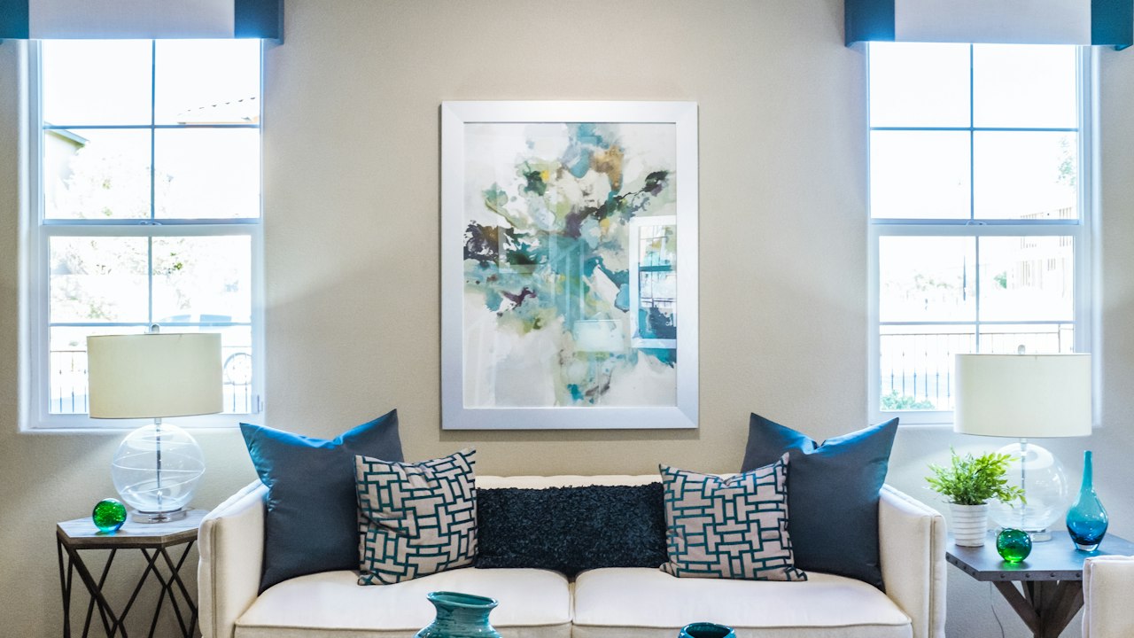
Understated, contemporary mushroom shade that works particularly well with crisp white wood trims and dark accents.
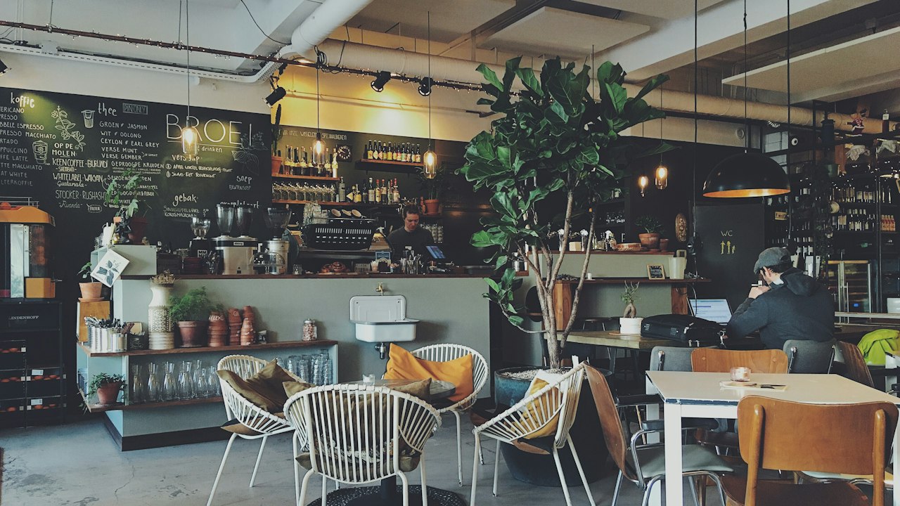
Appealing latte tone favored by cafes, casual dining restaurants, and modern hospitality waiting lounges.
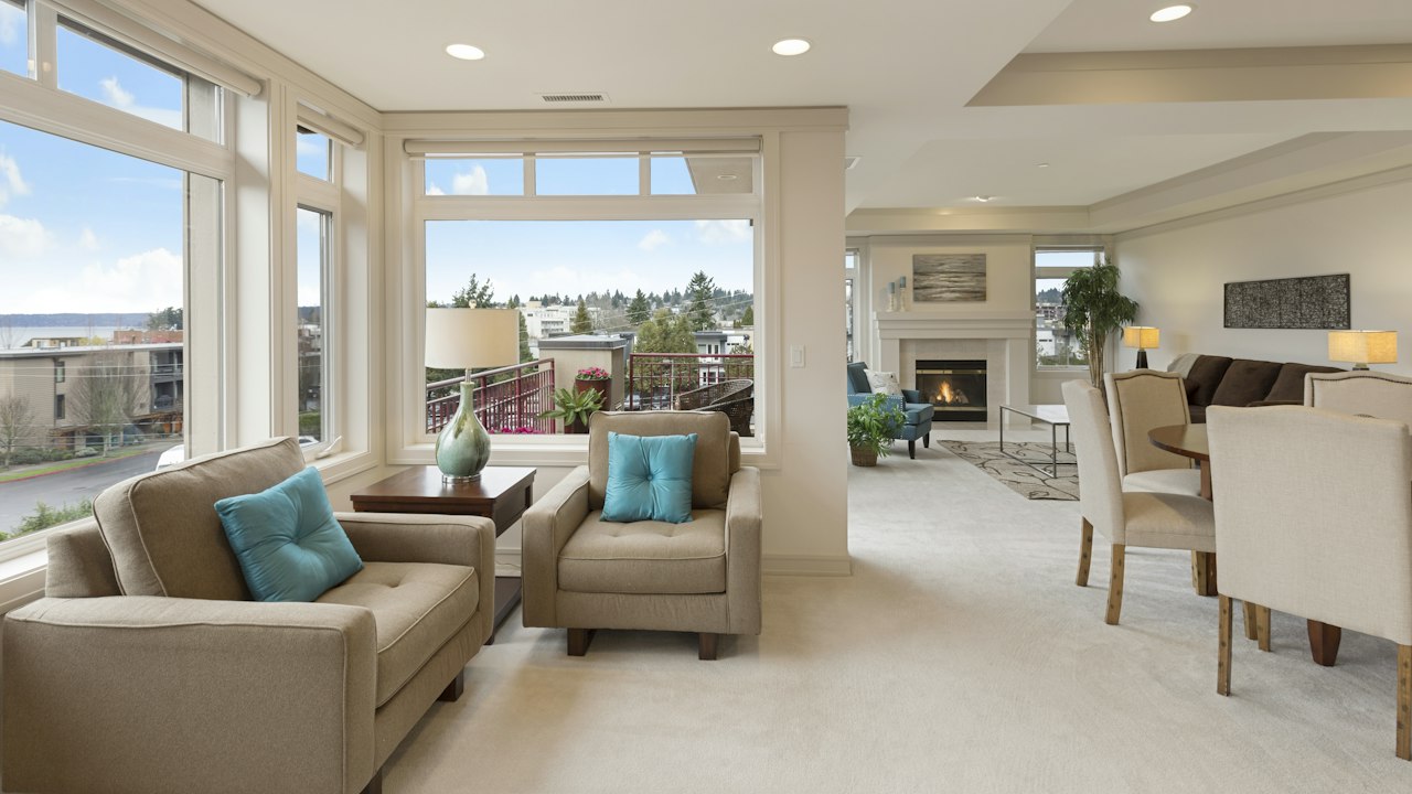
Very light, airy grey. Gives small bedrooms and apartments an open, spacious atmosphere with a modern touch.
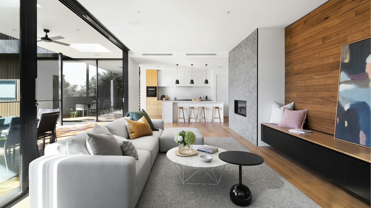
Clean, versatile modern grey. The standard contemporary neutral for urban apartment living rooms and open-plan offices.
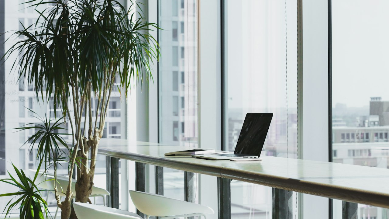
Luminous, crisp grey that pairs exceptionally well with polished chrome fixtures, white trims, and glass partitions.

Dependable mid-tone grey. Provides noticeable contrast against white ceilings and doors without absorbing too much room light.
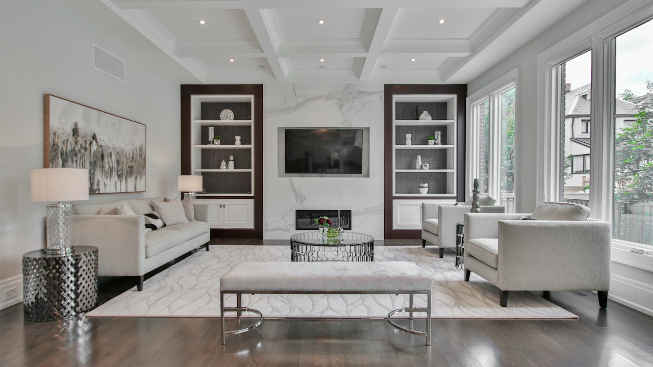
Comfortable greige that bridges modern grey minimalism with cozy warmth. Excellent for bedrooms and family rooms.
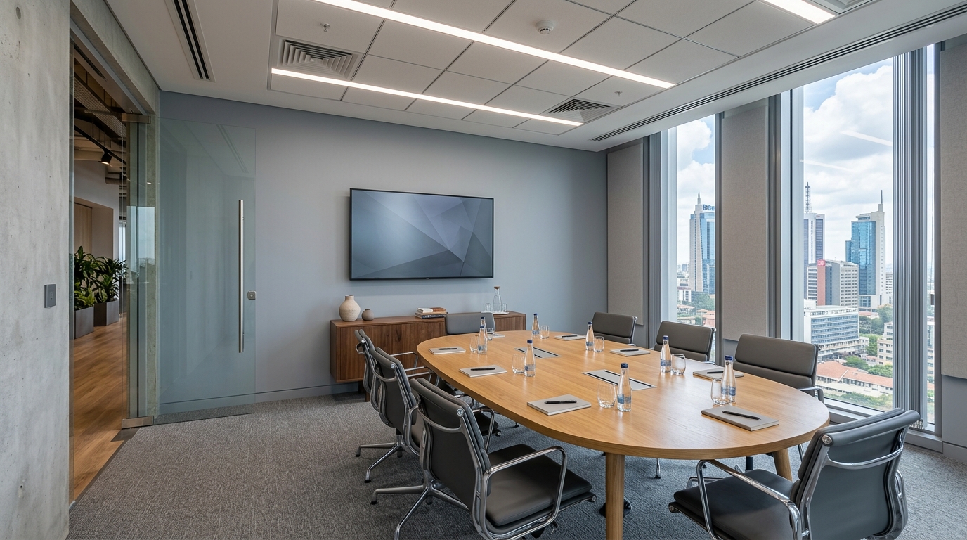
Focused, modern cool grey. Popular in creative agencies, meeting rooms, and contemporary urban bathrooms.
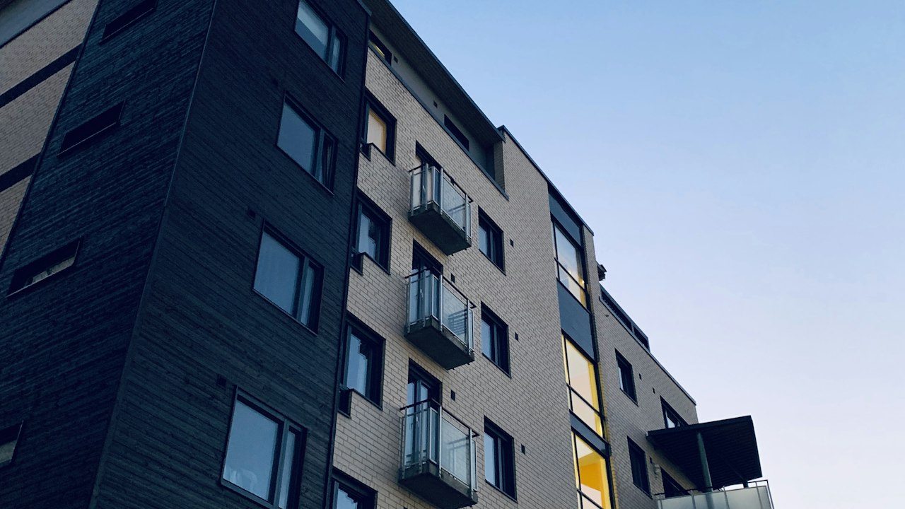
Solid masonry grey reminiscent of dressed stone. Highly durable on exterior facade plaster and perimeter boundary pillars.
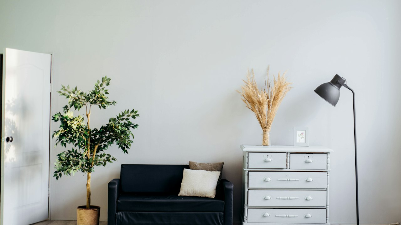
Raw architectural concrete shade. Ideal for feature pillars, industrial loft conversions, and commercial retail interiors.
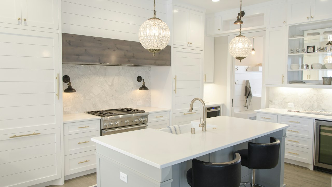
Balanced mid-depth grey. A dependable anchor tone for feature alcoves, doors, kitchen islands, and apartment corridors.
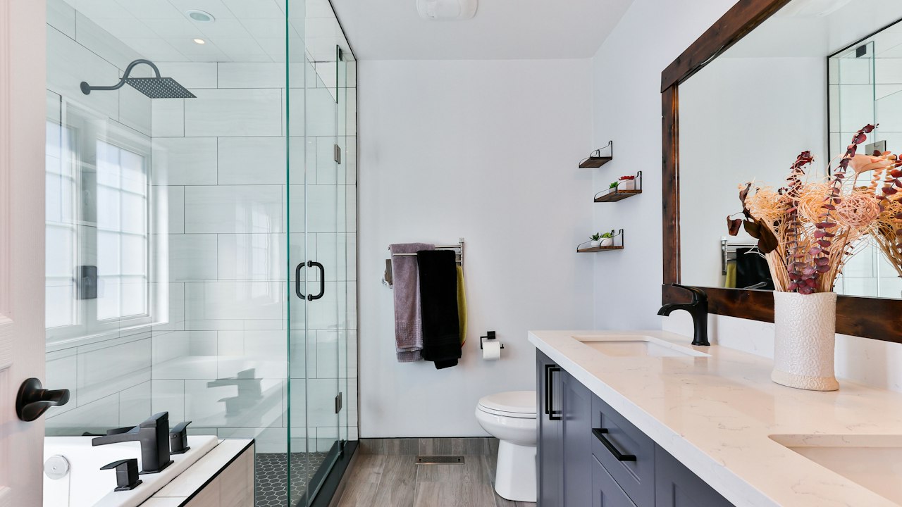
Deep, masculine slate tone. Creates striking contrast when paired with off-white walls, brass lighting, and light timber.
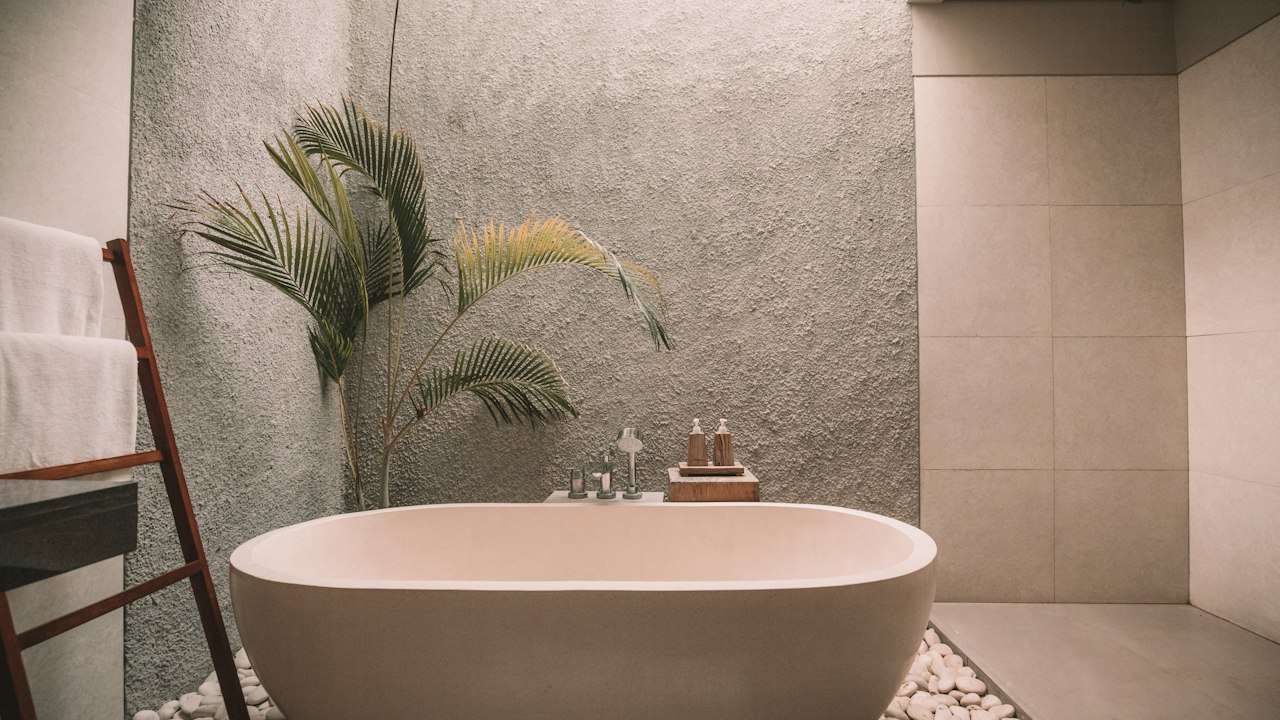
Strong dark grey that provides dramatic visual weight for media units, exterior window surrounds, and statement feature walls.
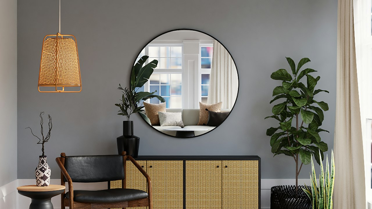
The premier deep accent shade. Transforms dining rooms, home theaters, and master bedrooms into luxurious, cocooning spaces.
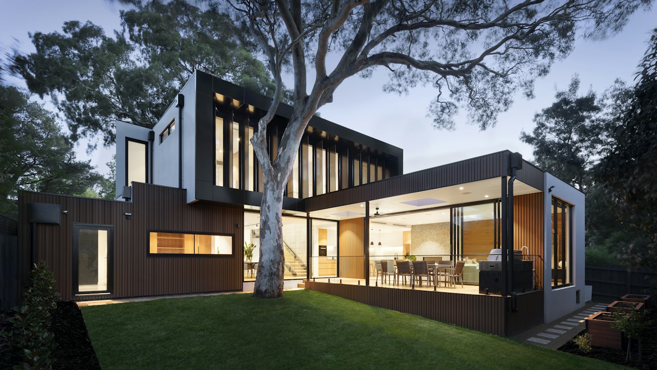
Intense graphite grey. Ideal for steel gates, metal railings, exterior fascia boards, and modern architectural boundary details.
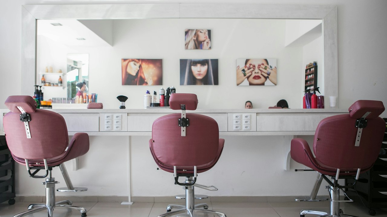
Near-black volcanic charcoal with immense presence. Perfect for boutique retail backdrops, moody powder rooms, and exterior accents.
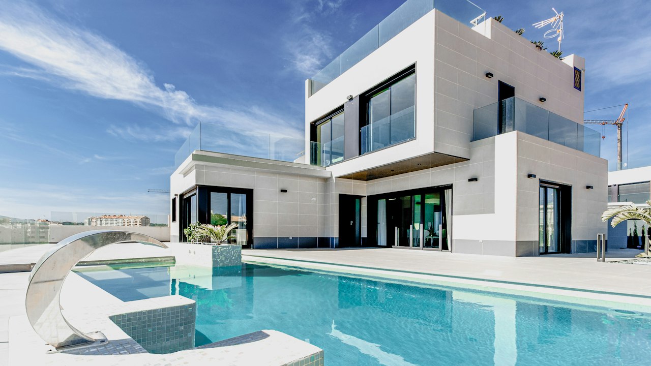
Deepest architectural black-grey. Used for striking contrast lines, metalwork, exterior trims, and dramatic feature panels.
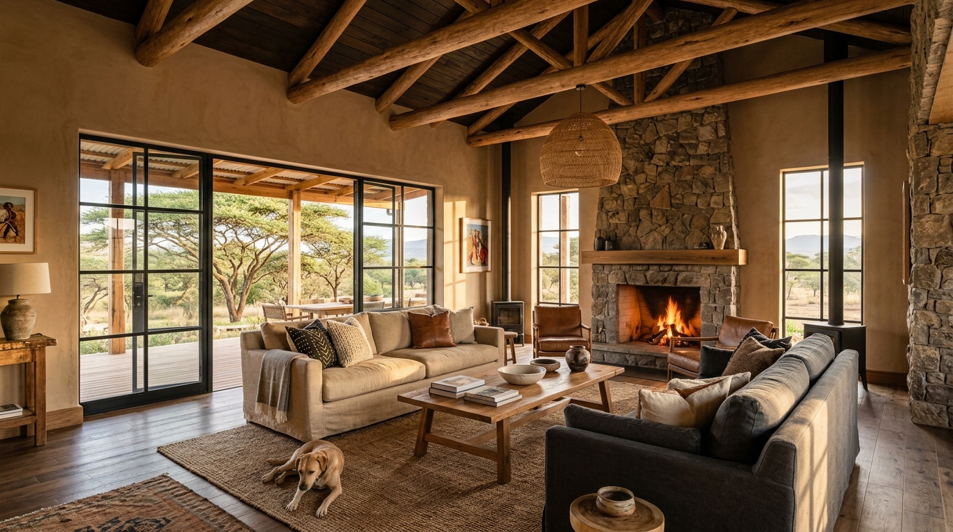
Natural cedar wood tone. Enriches living rooms, veranda walls, and studies with comfortable, rustic warmth.
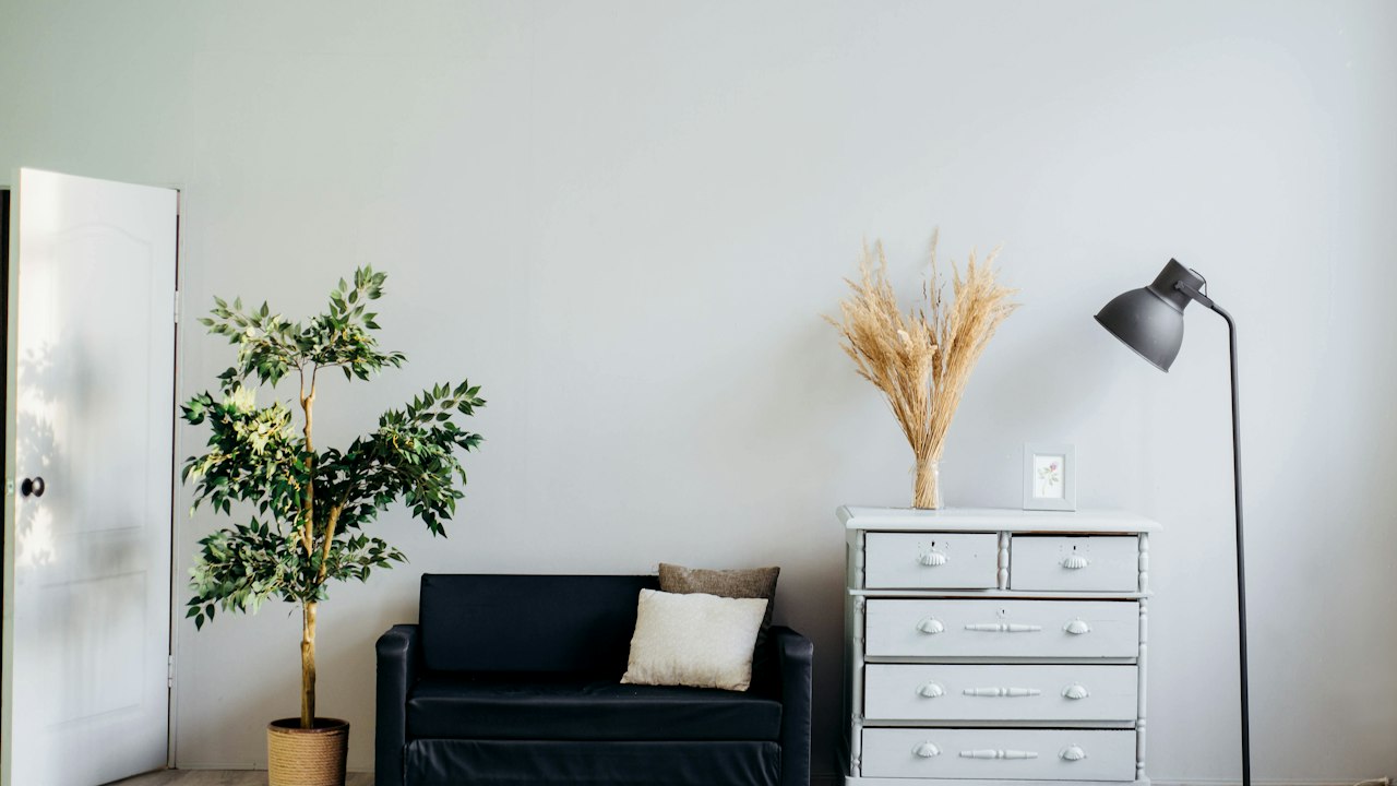
Balanced timber brown that pairs naturally with leather furniture, indoor plants, and natural stone flooring.
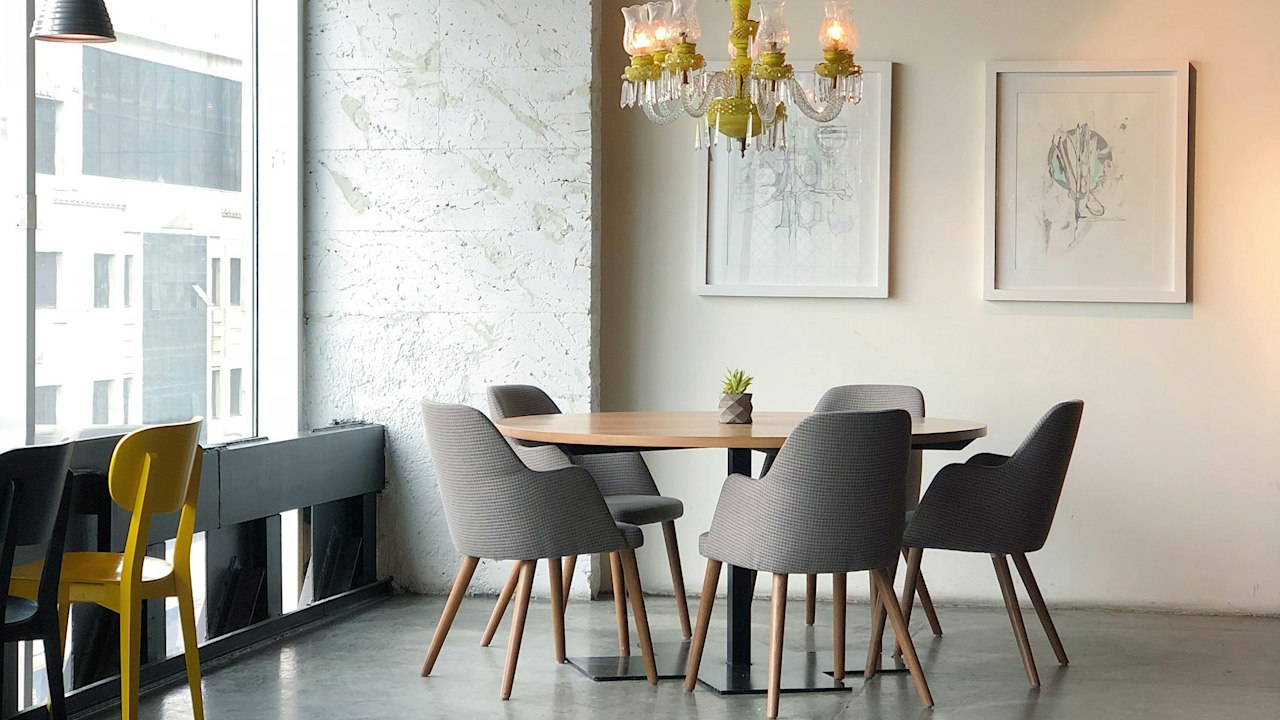
Comfortable roasted chestnut shade. Ideal for dining rooms, library nooks, and hospitality lounges.

Deep, rich cocoa shade. Adds inviting character to coffee bars, executive reception areas, and reading corners.
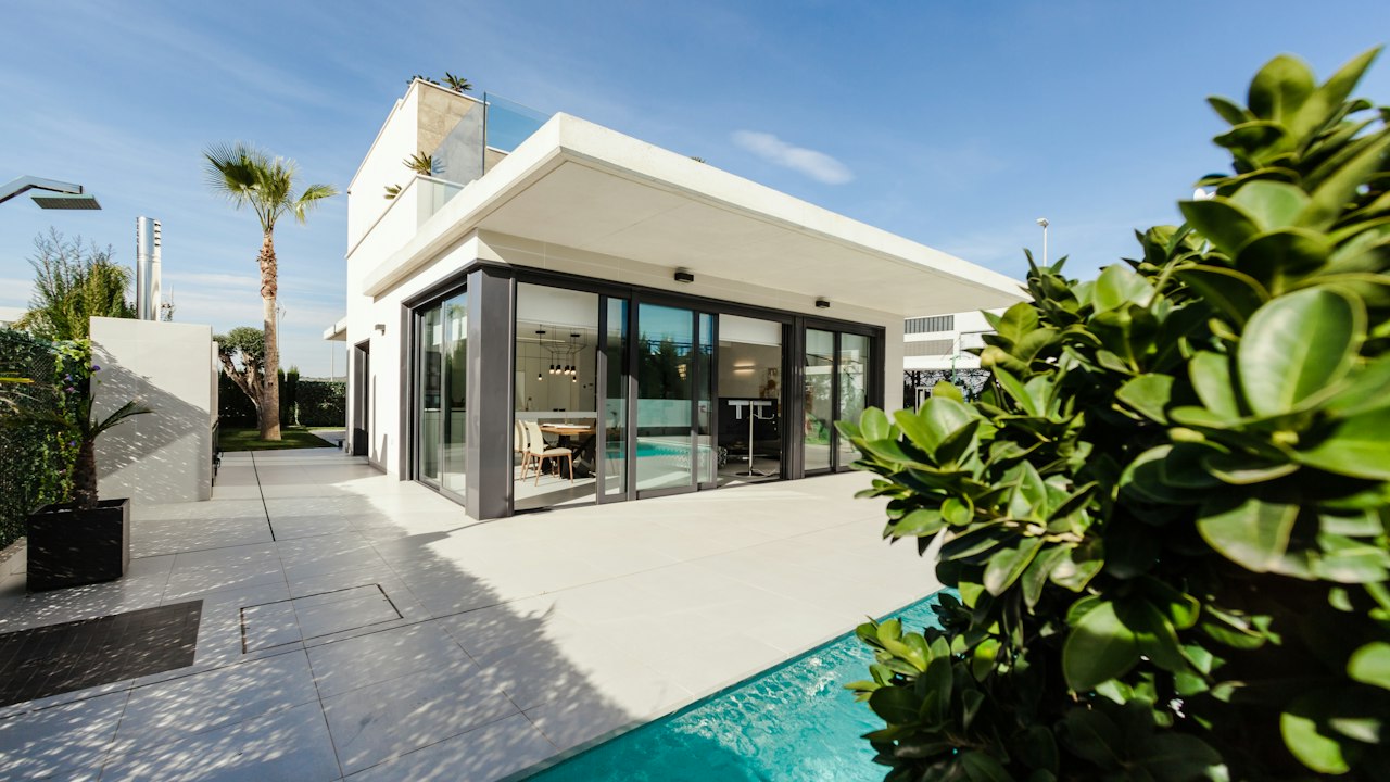
Classic dark roast brown. Widely used for external pillars, entrance doors, and perimeter accents across Kenya.
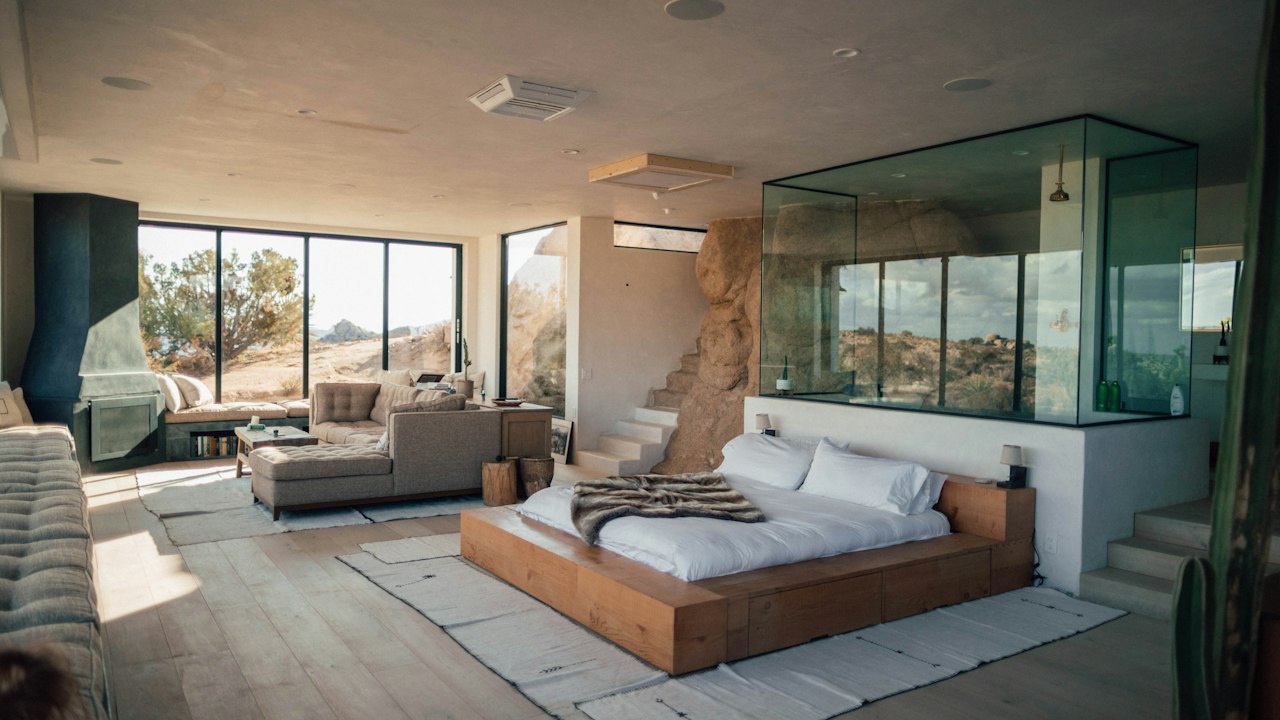
Luxurious dark chocolate brown. Creates a distinguished, cocooning presence in executive studies and hotel cocktail lounges.
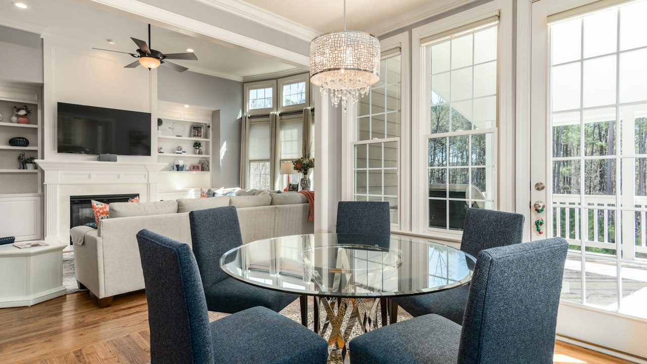
Hardwood walnut shade. Delivers dignified depth to skirting, paneled studies, and feature walls.
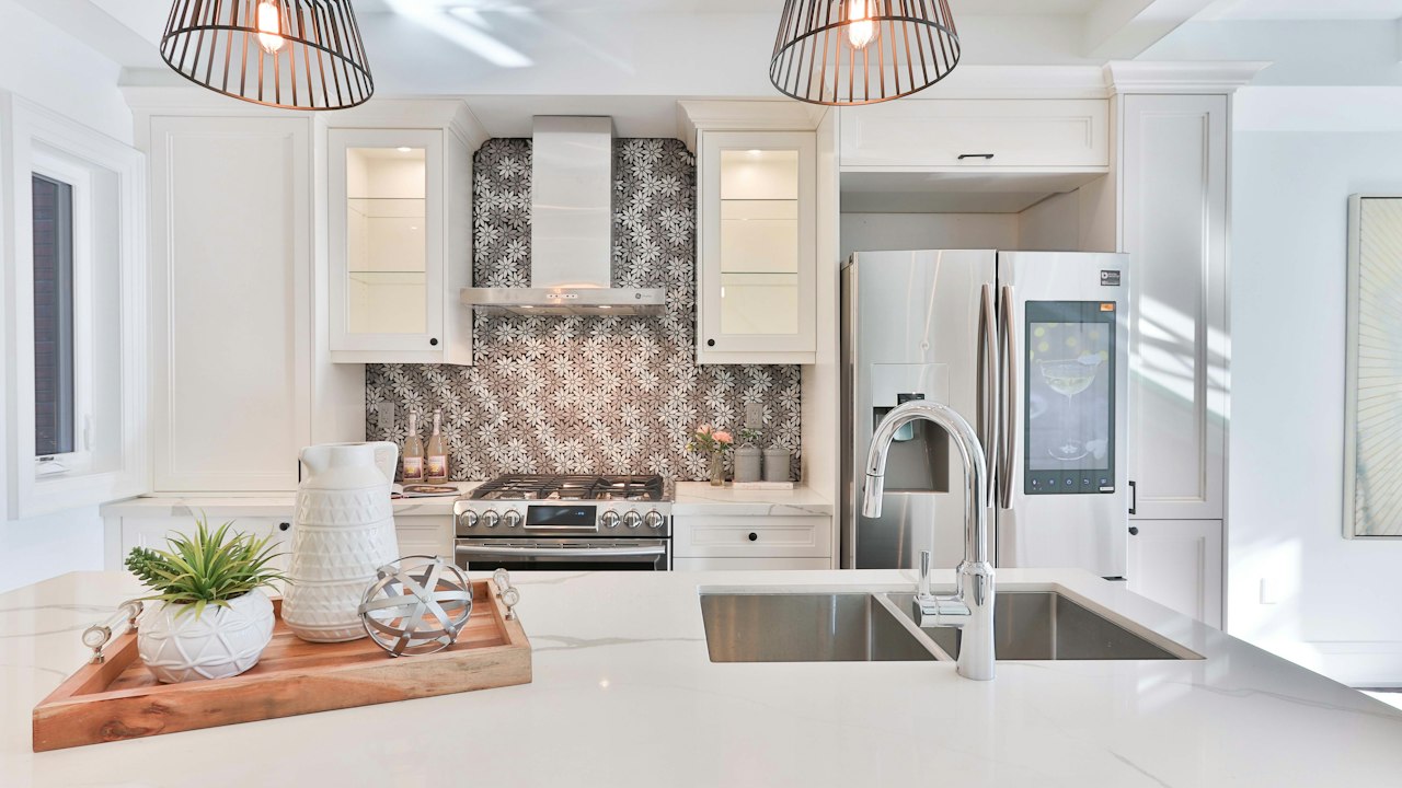
Very dark earth brown. Robust on boundary walls, external concrete bases, and security gates, masking soil splashes effectively.
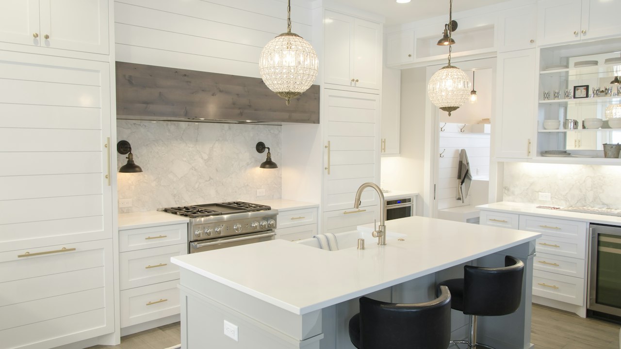
Grounded loam brown that connects indoor living spaces with the natural outdoor landscape.
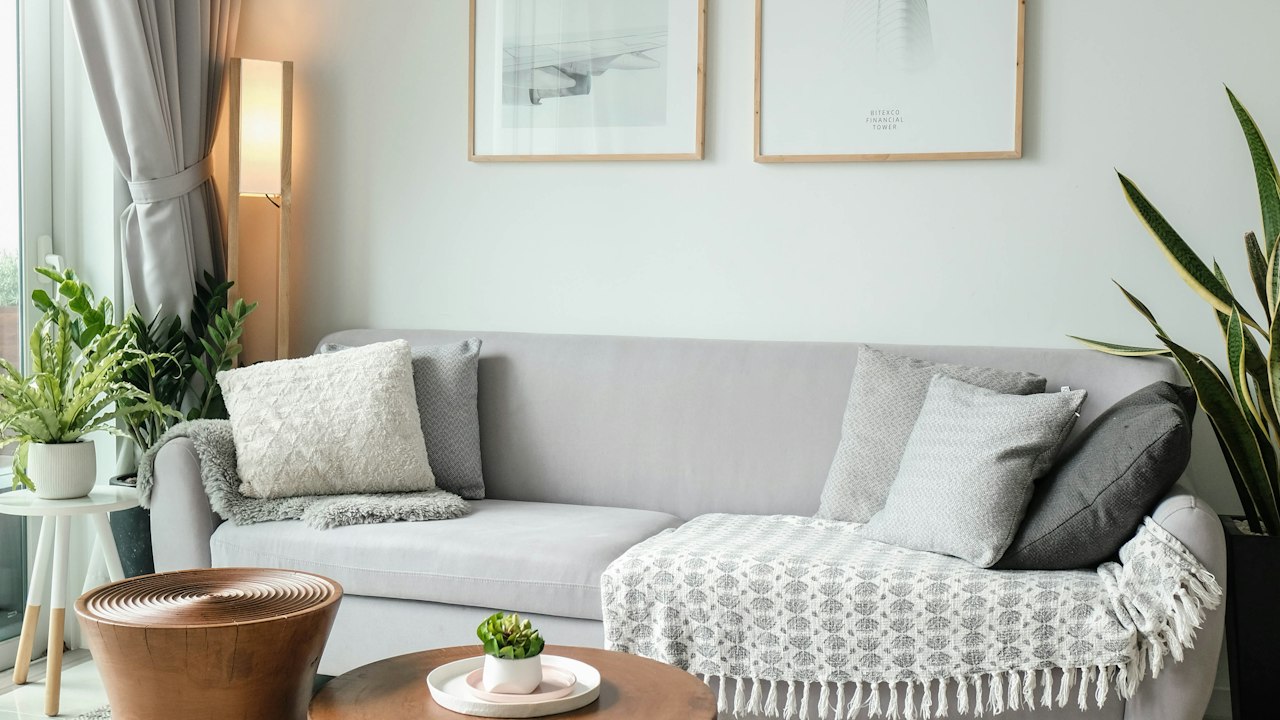
Warm pottery clay shade. Adds rich earthen character to verandas, dining spaces, and exterior masonry.
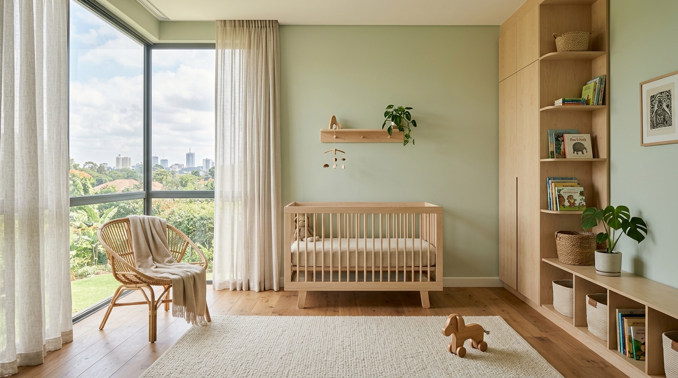
Very gentle, tranquil light green. Restful for nursery rooms, guest bedrooms, and quiet wellness spaces.
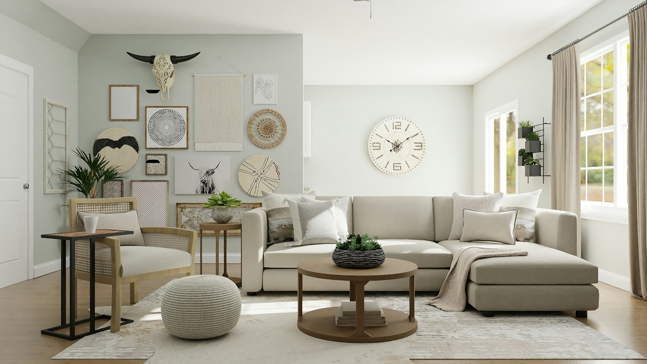
Silvery, muted green. A highly popular contemporary choice for bedrooms, bathrooms, and modern kitchen cabinetry.
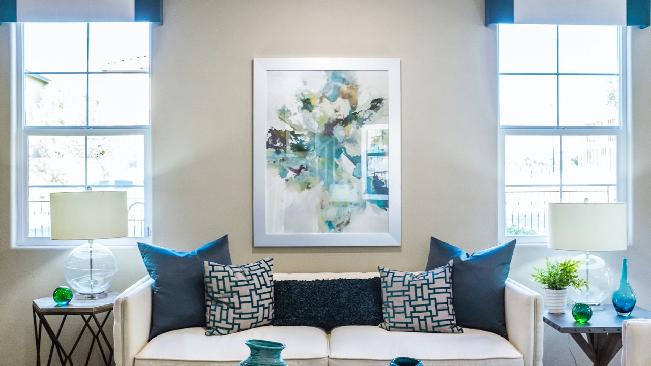
Dusted eucalyptus green with understated sophistication. Excellent for home studies, reading nooks, and cafes.
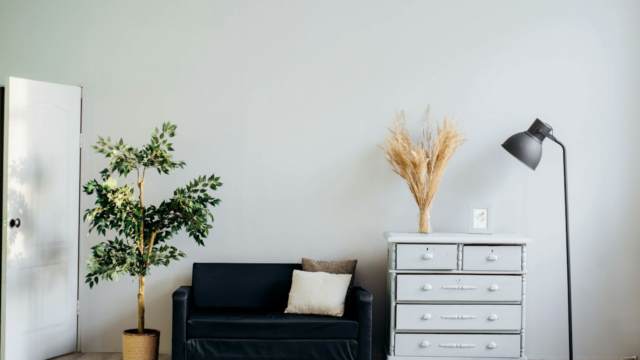
Earthy, natural olive green. Highly weather-resistant on exterior boundary walls and handsome on interior feature accents.
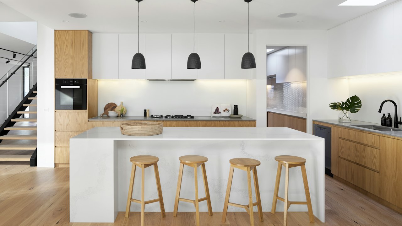
Deep, earthy forest moss shade. Pairs beautifully with terracotta tiles, natural stone, and warm brass fixtures.
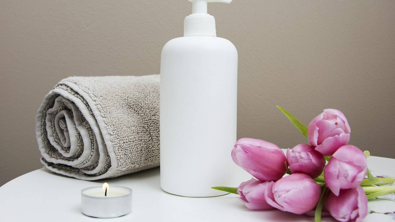
Lush, vibrant garden green. Creates an invigorating focal wall in children’s study areas, breakfast rooms, or creative offices.
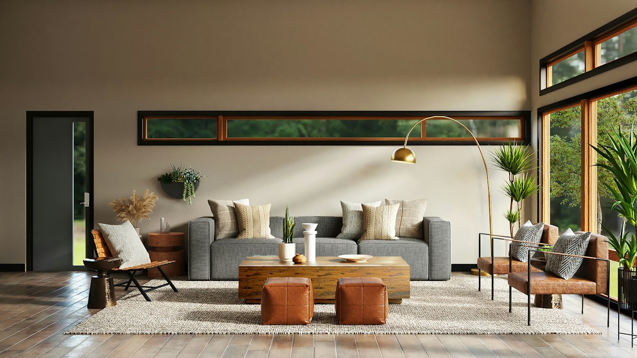
Deep, luxurious botanical green. Complements natural timber, brass accents, and stone surfaces in studies and dining rooms.
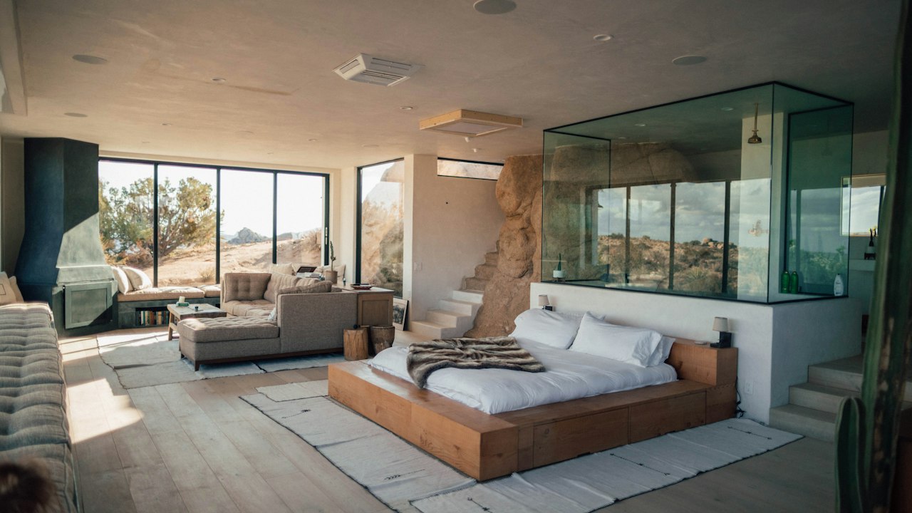
Very dark, regal green. Perfect for intimate boutique hotel reception spaces, feature panels, and formal libraries.
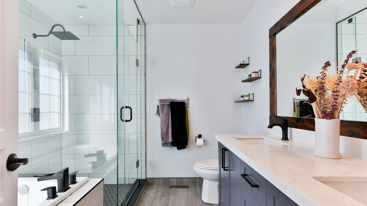
Striking jewel emerald green. Makes an impactful statement in hospitality reception areas, powder rooms, and boutique retail.
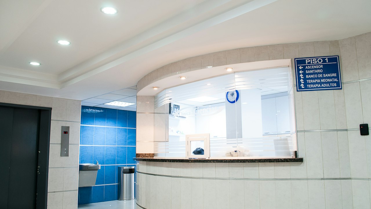
Fresh, hygienic light green. Especially suitable for medical clinics, wellness centers, kitchens, and bright washrooms.
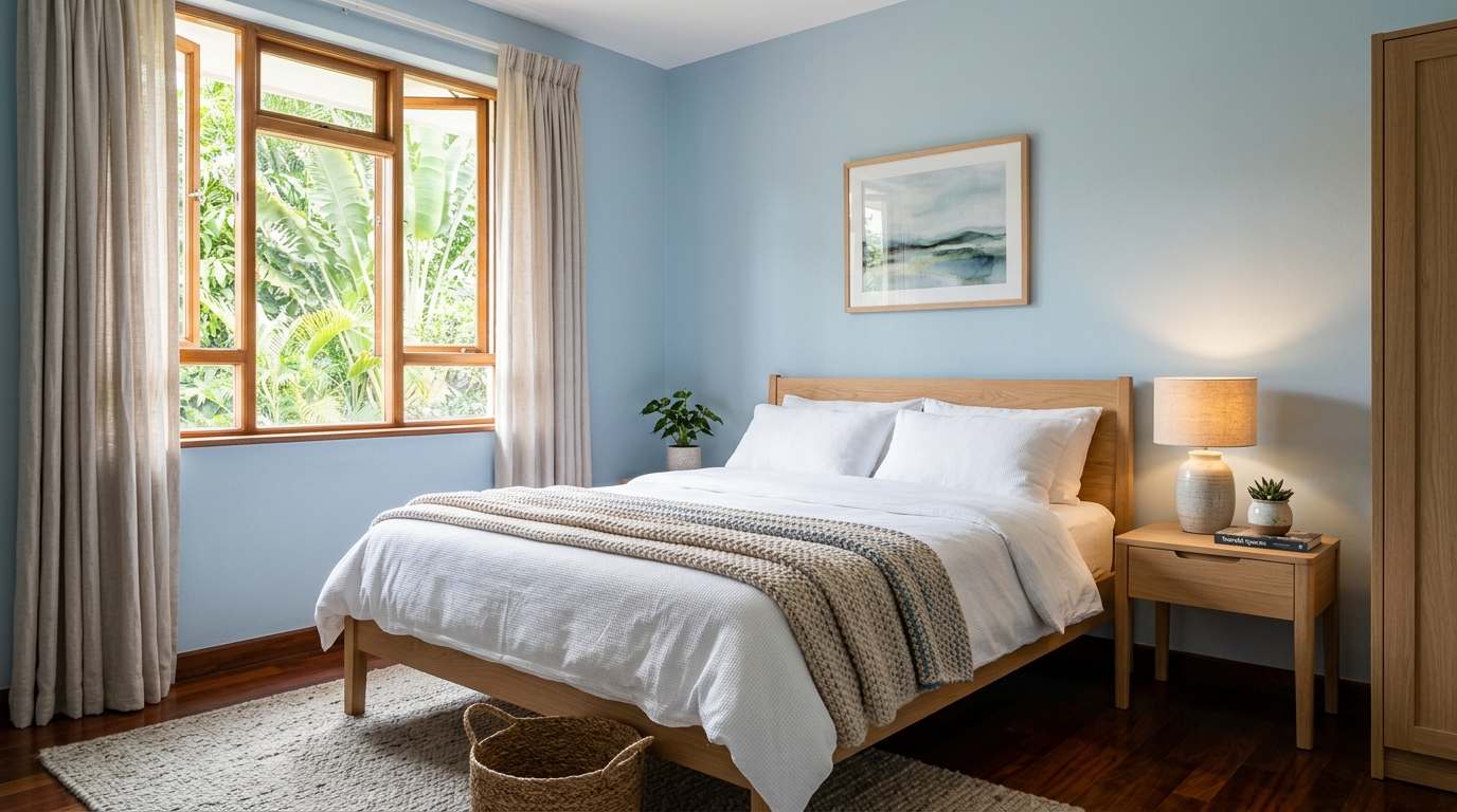
Airy, tranquil pale blue. Creates a calming environment in children’s bedrooms, guest suites, and compact bathrooms.
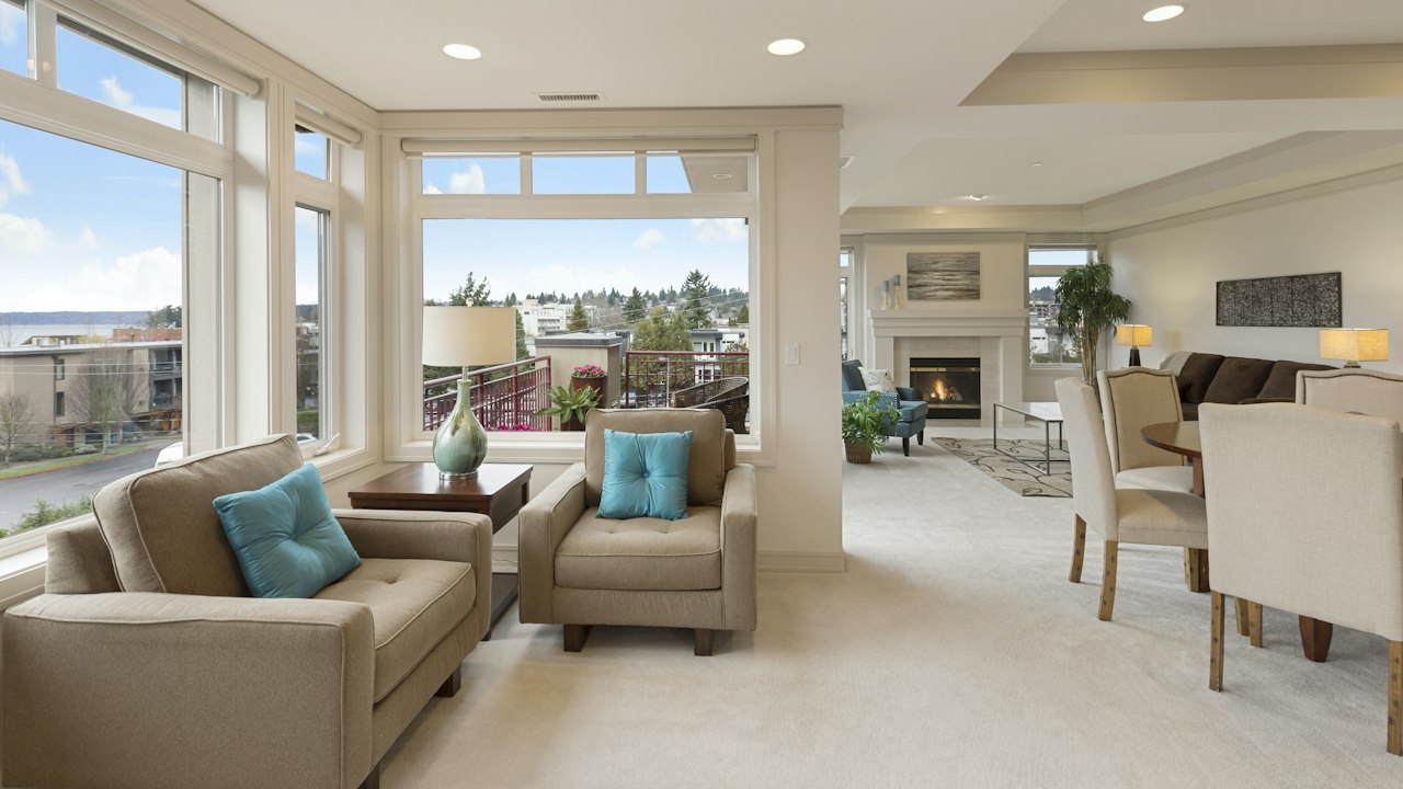
Clear, uplifting sky blue. Reflects daylight generously, making interior rooms feel taller and brighter.
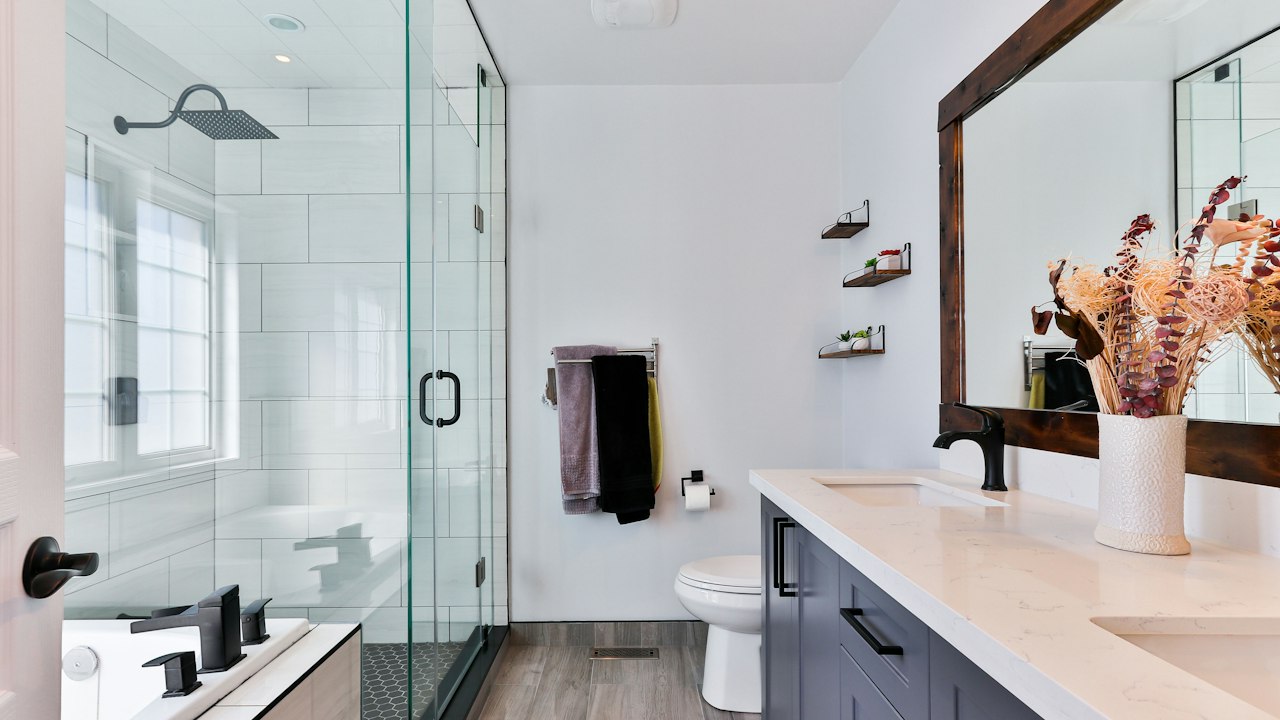
Refined, grey-balanced pastel blue. An elegant neutral alternative to white in modern bathrooms and dressing rooms.
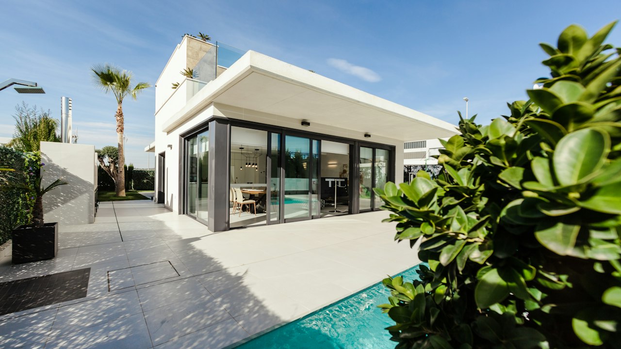
Subtle, fresh tint of blue. Excellent for veranda ceilings and small washrooms that benefit from a light, airy touch.
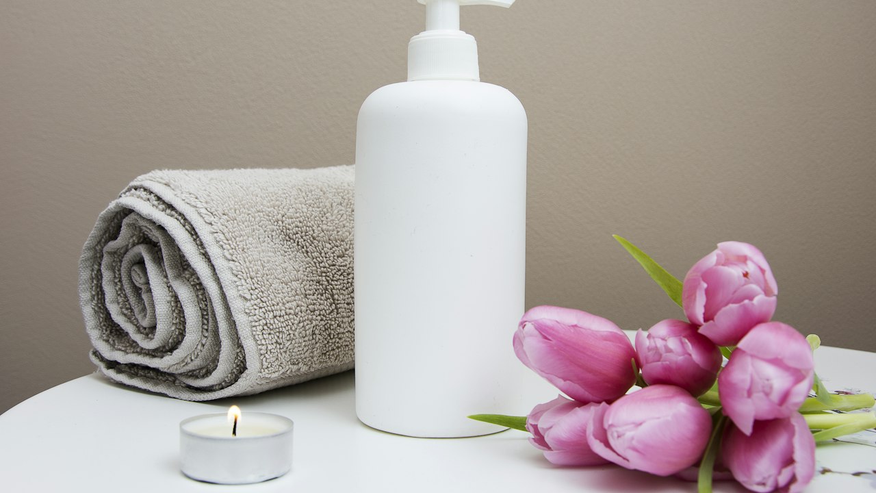
Refreshing marine blue-green. Highly effective in coastal residences, swimming pool changing facilities, and spa bathrooms.
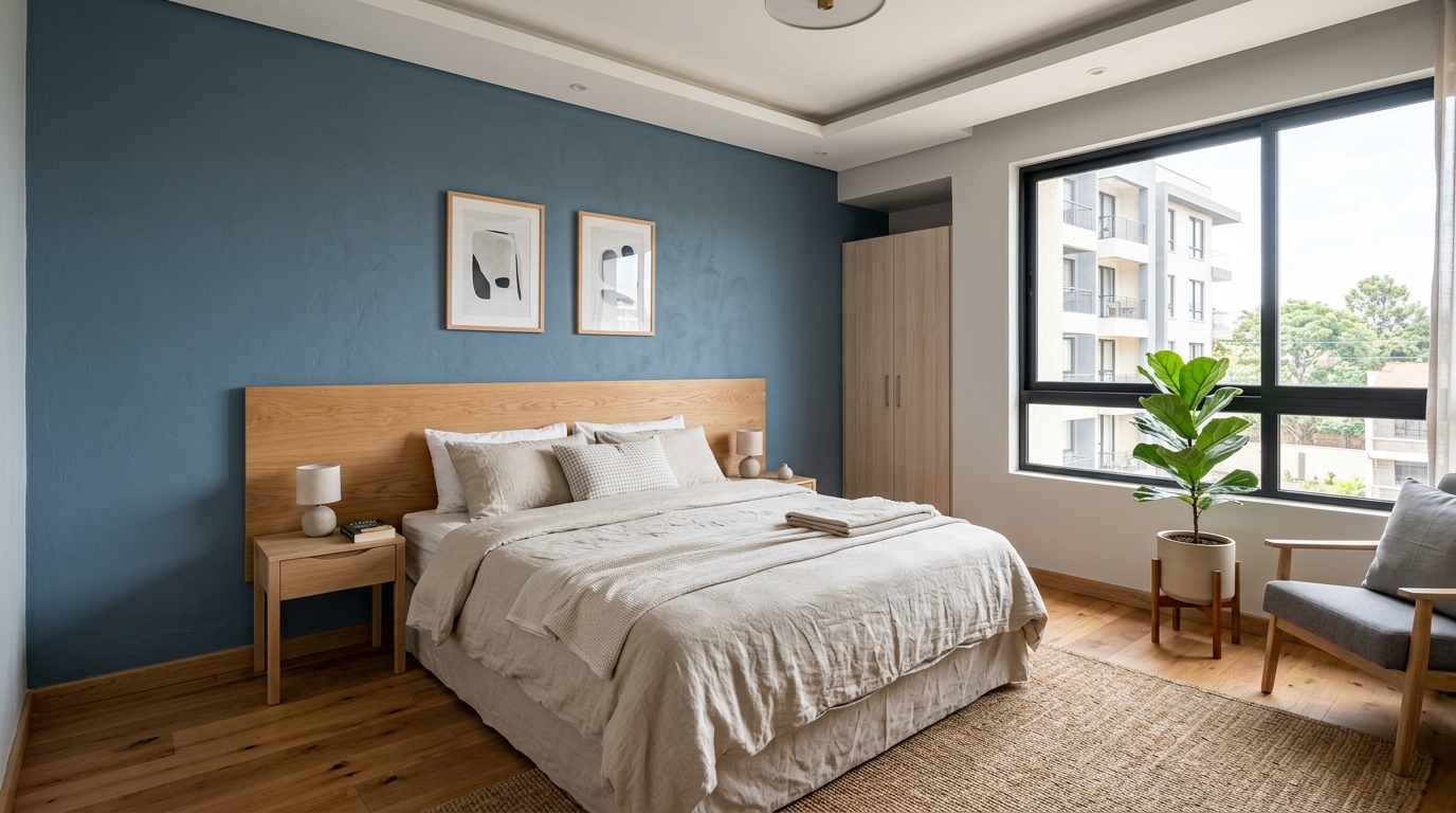
Muted slate-blue. A timeless, versatile choice for living rooms, master bedrooms, and home studies.
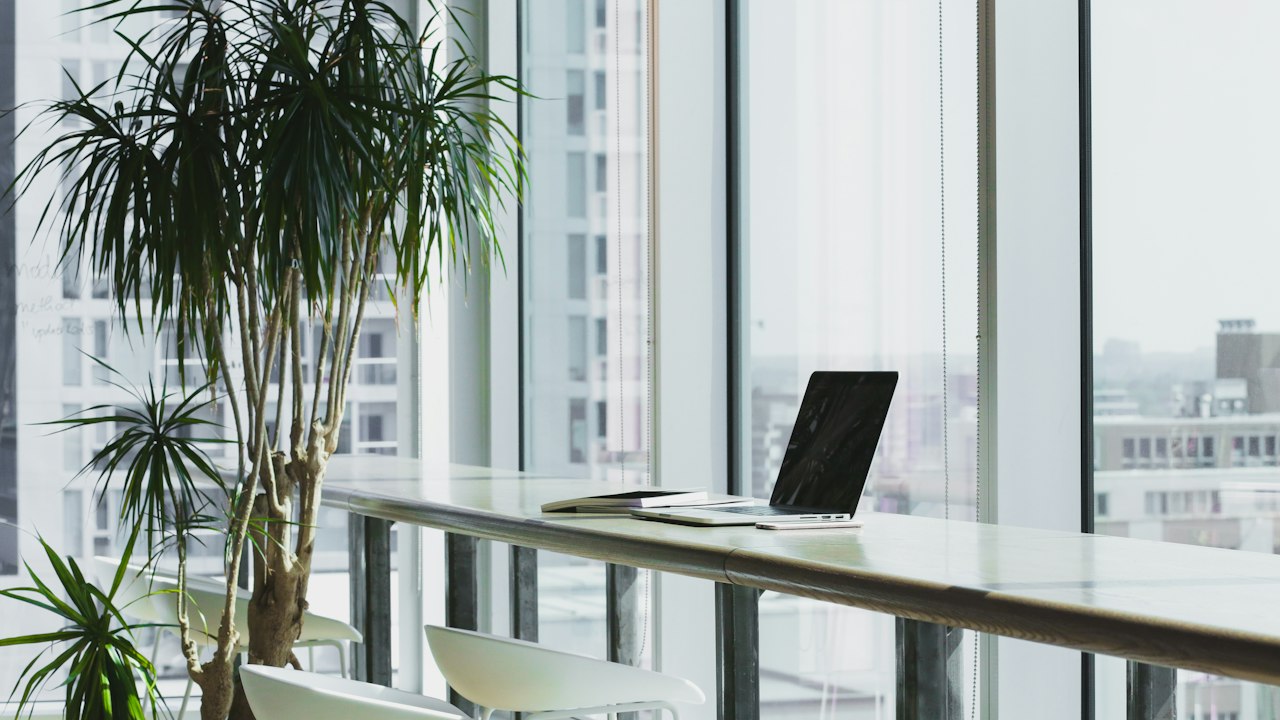
Authoritative, balanced steel blue. Ideal for commercial offices, consultancies, and modern kitchen feature islands.
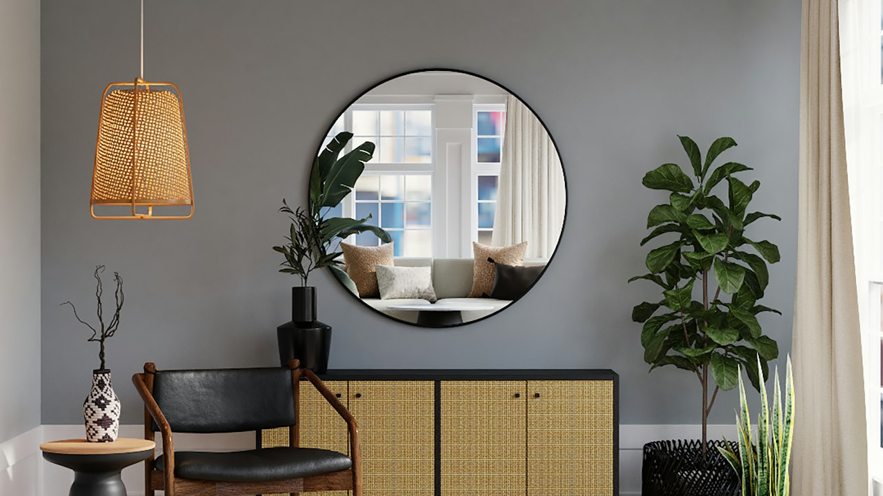
Deep oceanic slate blue. Beautifully showcases light timber open shelving, art canvases, and warm metal hardware.
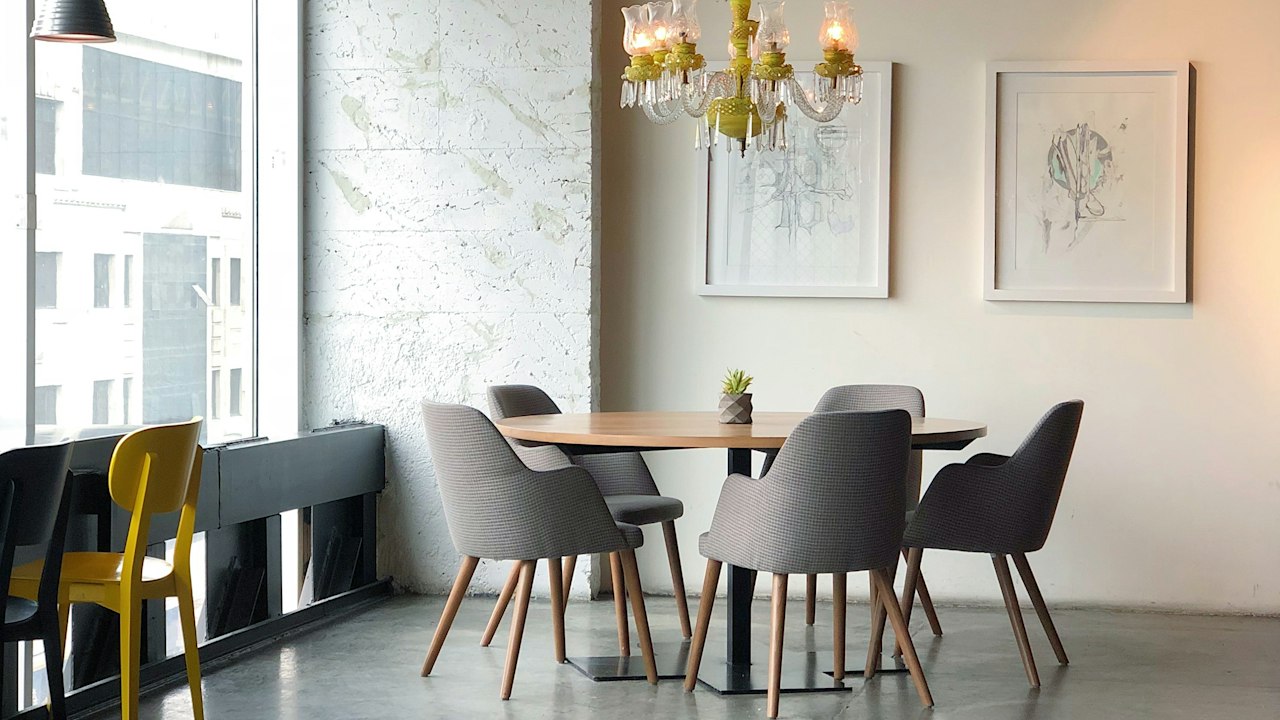
Majestic cobalt blue. Best reserved for statement feature walls in restaurants, entertainment suites, and reception alcoves.
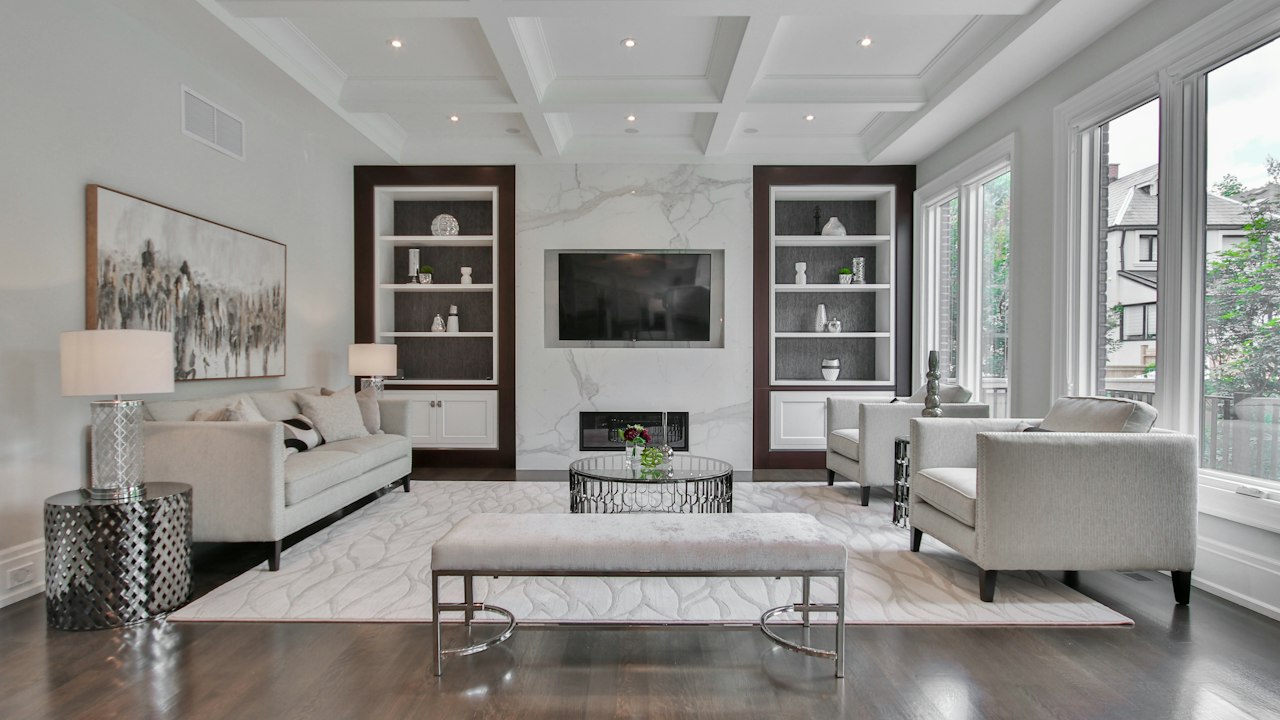
Commanding oceanic blue. Highly effective for master suite accent walls, modern home offices, and formal libraries.

Classic deep navy. The premier choice for corporate boardrooms, executive offices, and luxurious kitchen island bases.
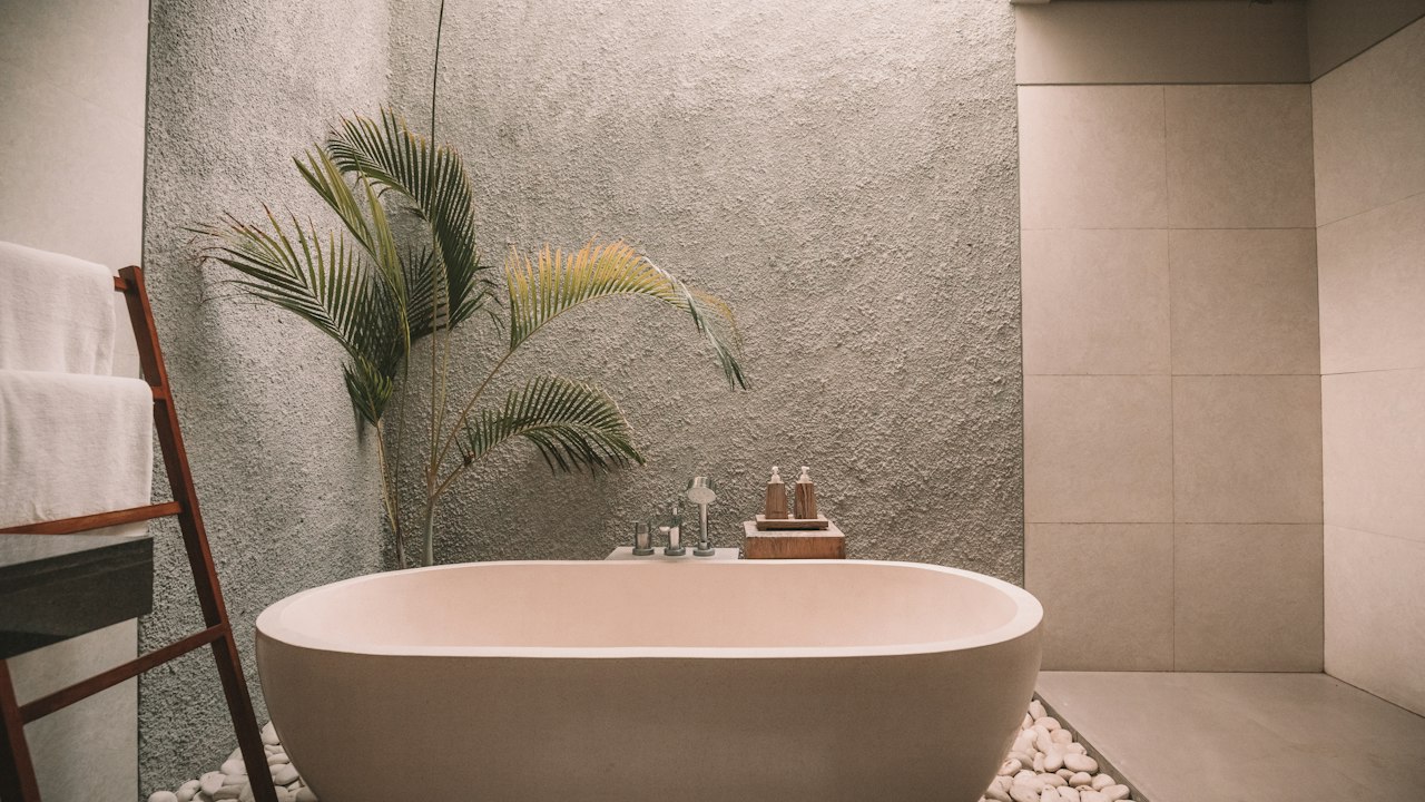
Inky near-black navy. Creates an immersive, cozy experience in home cinema rooms, listening lounges, and luxury powder rooms.
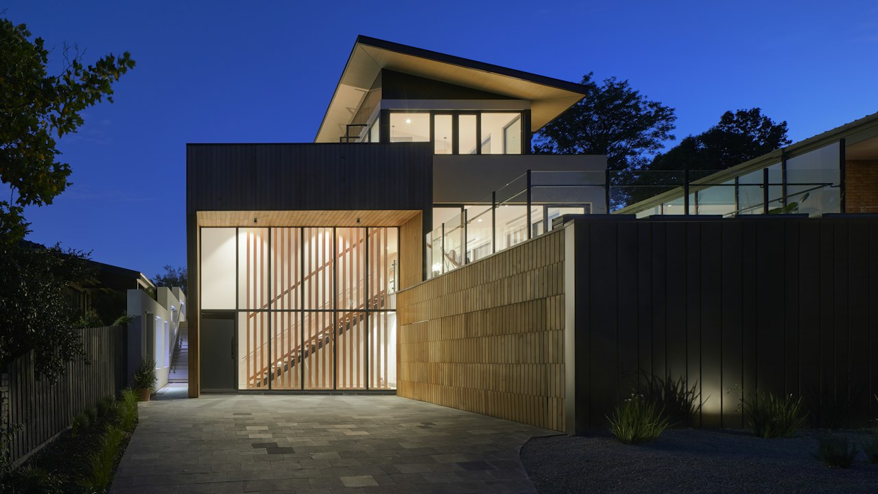
Cheerful, gentle buttercup yellow. Brightens shaded kitchens, pantry areas, and utility rooms with friendly morning light.
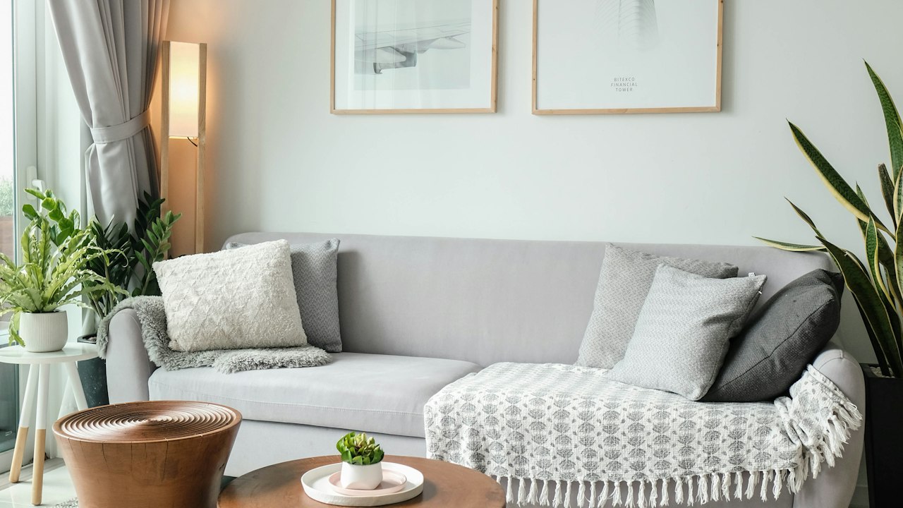
Warm, sunny cream yellow. Adds welcoming comfort to dining spaces, schools, and family day rooms.

Radiant tropical yellow. Stimulates creativity and optimism in school classrooms, playrooms, and fitness reception desks.
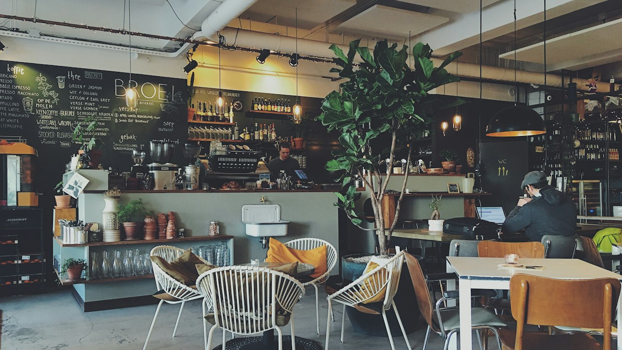
Lively sunflower gold. Perfect for casual dining accent walls, boutique storefronts, and vibrant children’s study areas.
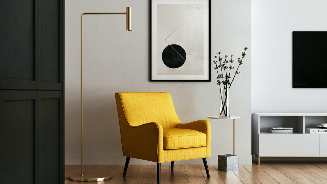
Muted, spicy mustard yellow. A stylish architectural accent shade that brings warmth to modern living rooms and hotel lounges.
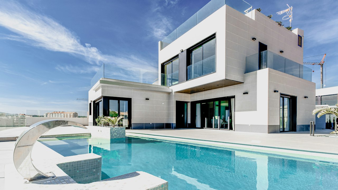
Classic earth mineral ochre. Well-suited for exterior facades, perimeter walls, and verandas across diverse Kenyan climates.
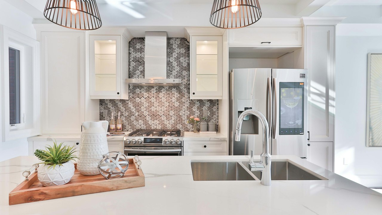
Durable golden ochre shade. Highly resistant to UV fading, making it ideal for exterior boundary walls and gate structures.
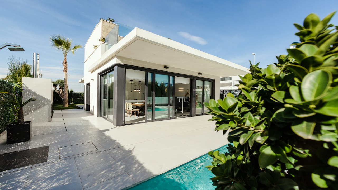
Deep, earthy ochre tone. Conceals dust and road splashes gracefully on exterior walls, plinths, and garden enclosures.
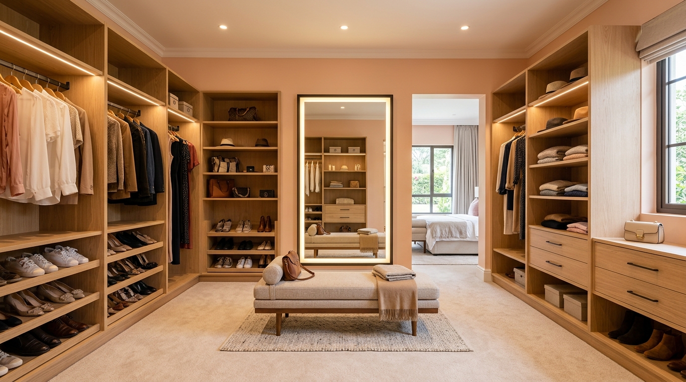
Gentle, flattering peach tint. Reflects warm light in master bathrooms, dressing rooms, and children’s bedrooms.
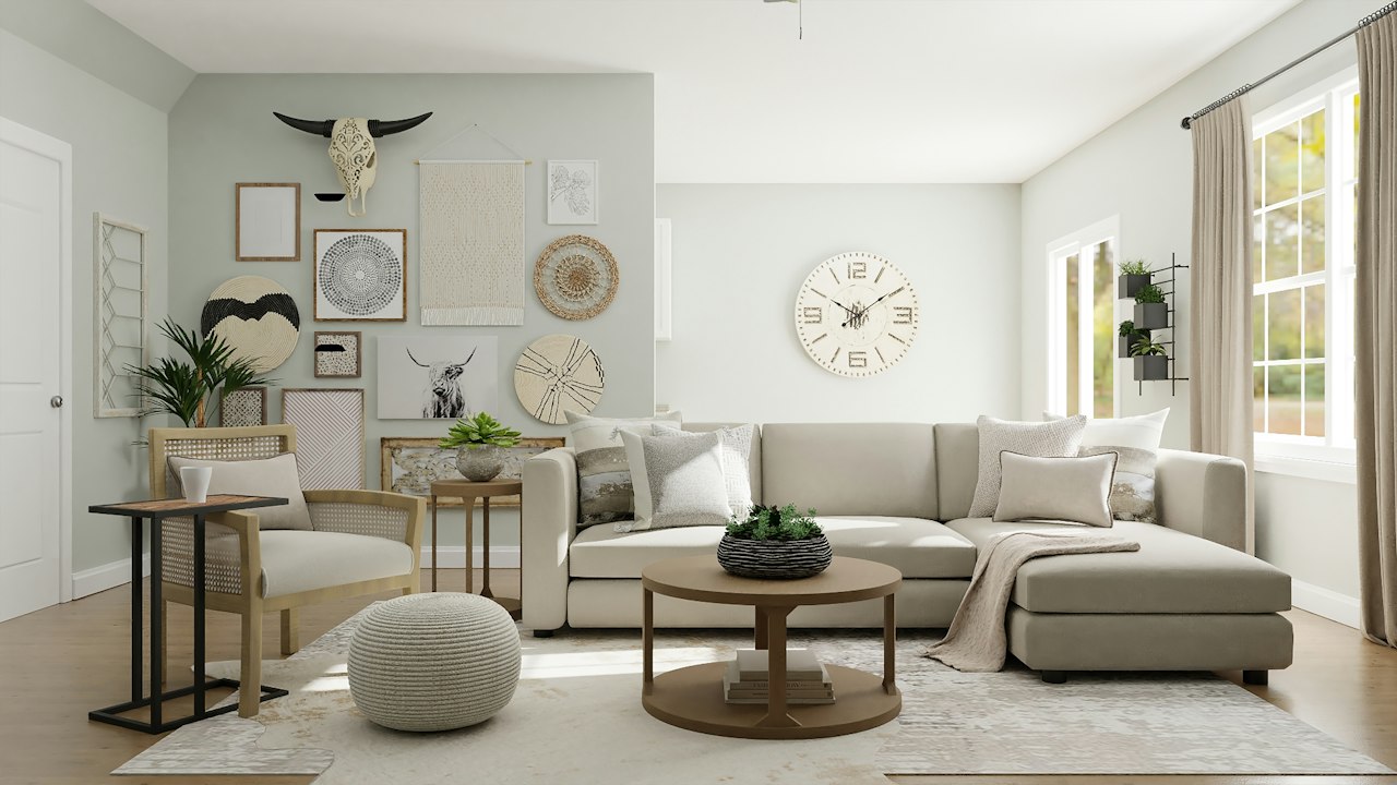
Blush-infused warm beige. Softens large open spaces and pairs naturally with neutral woven fabrics and light timber.

Invigorating sunset orange. Best suited for dining accent walls, restaurant bars, and dynamic workspace creative corners.
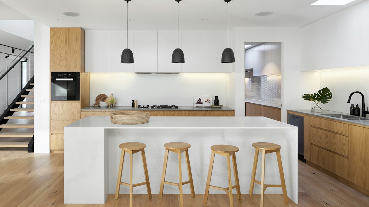
Rich, smoldering burnt orange. Creates a welcoming, sophisticated dining atmosphere alongside charcoal and dark timber trims.
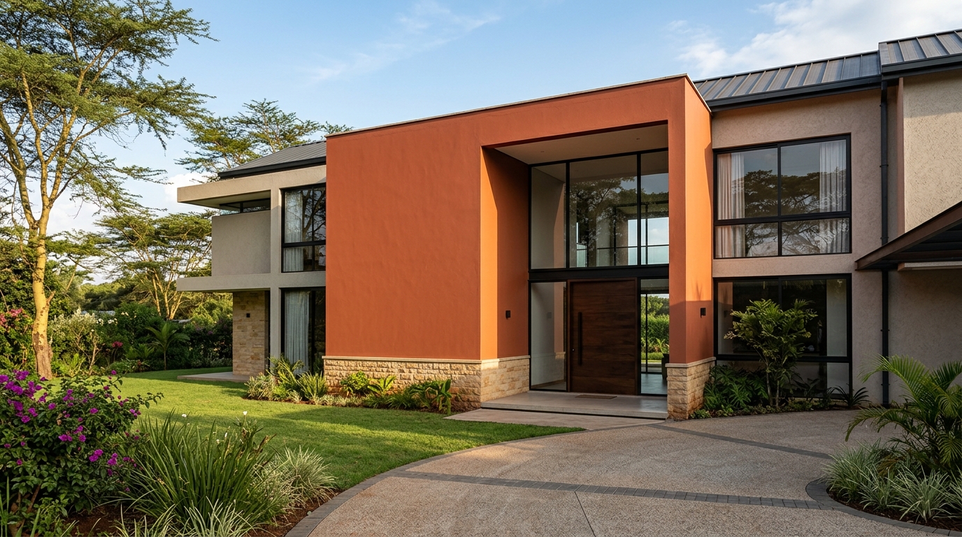
Authentic earthenware terracotta. A classic exterior and courtyard choice that harmonizes with indigenous landscaping and natural stone.
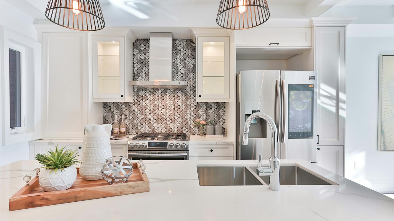
Deep, rustic burnt terracotta. Highly recommended for perimeter masonry walls and exterior gate pillars exposed to red soil terrain.
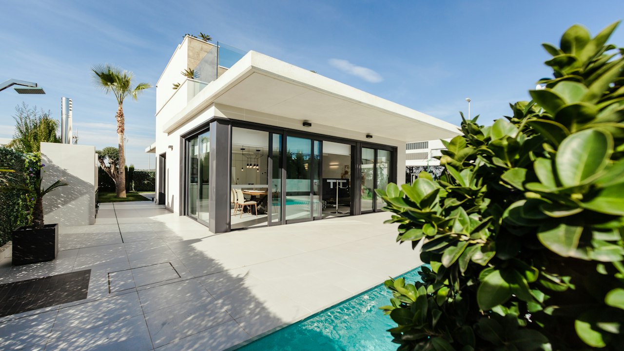
Warm Murram clay orange. A natural fit for outdoor barbecue verandas, safari cottages, and exterior perimeter plastering.
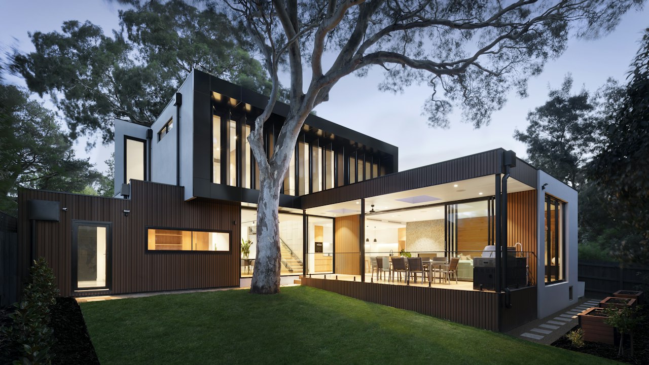
Deep, oxidized rust tone. Delivers striking architectural impact on entrance columns, metal security gates, and exterior trim.
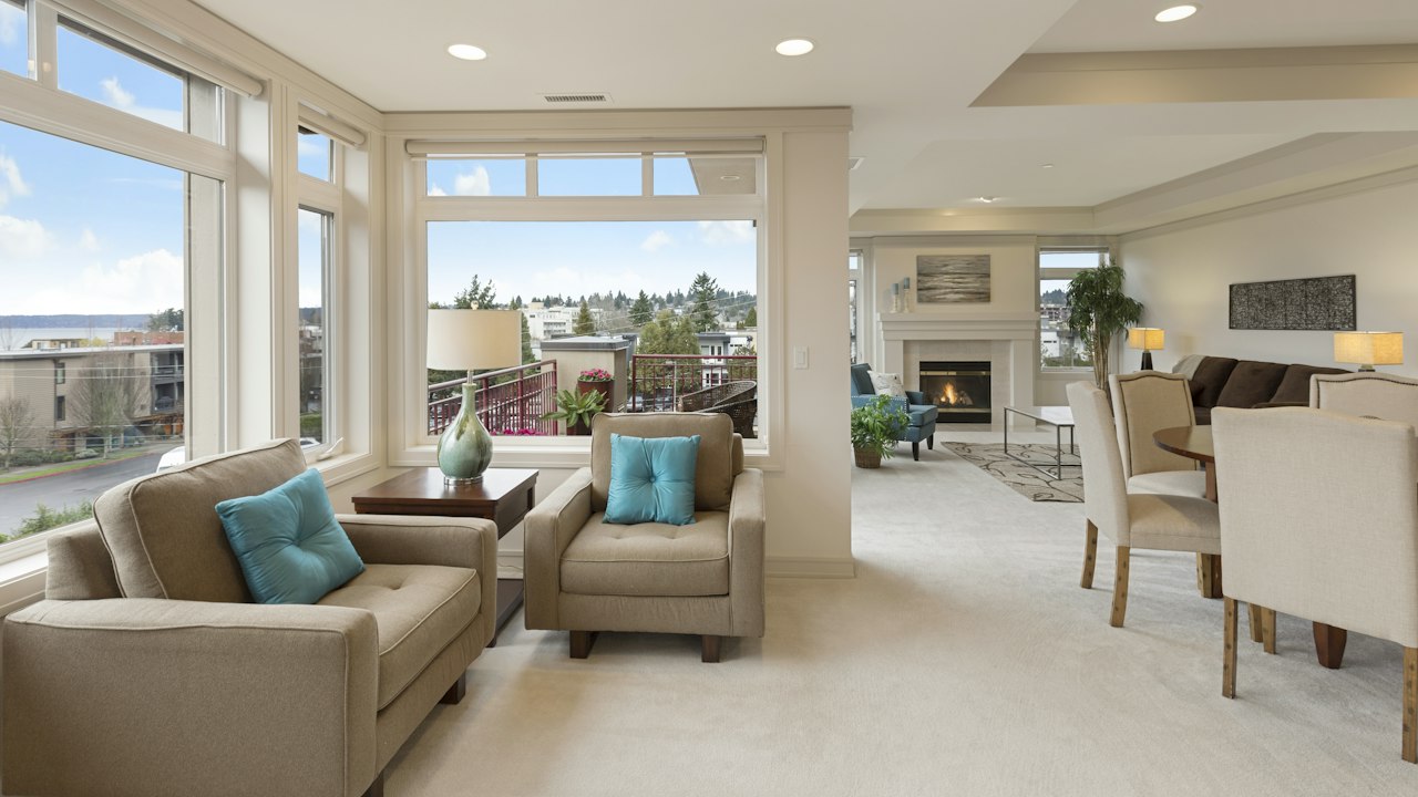
Delicate, soothing pastel pink. Creates a tranquil, gentle atmosphere in nurseries, powder rooms, and children’s bedrooms.
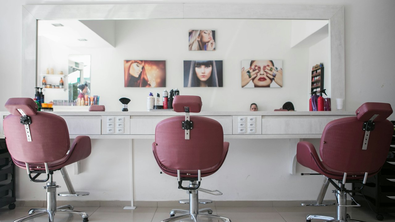
Sophisticated dusty rose. A chic neutral shade favored in beauty salons, boutique hotel suites, and modern bedrooms.
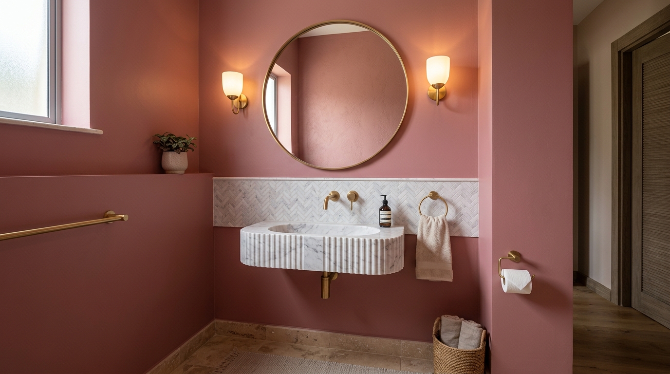
Warm, mature rose shade. Brings welcoming personality to powder rooms, creative studios, and boutique retail displays.
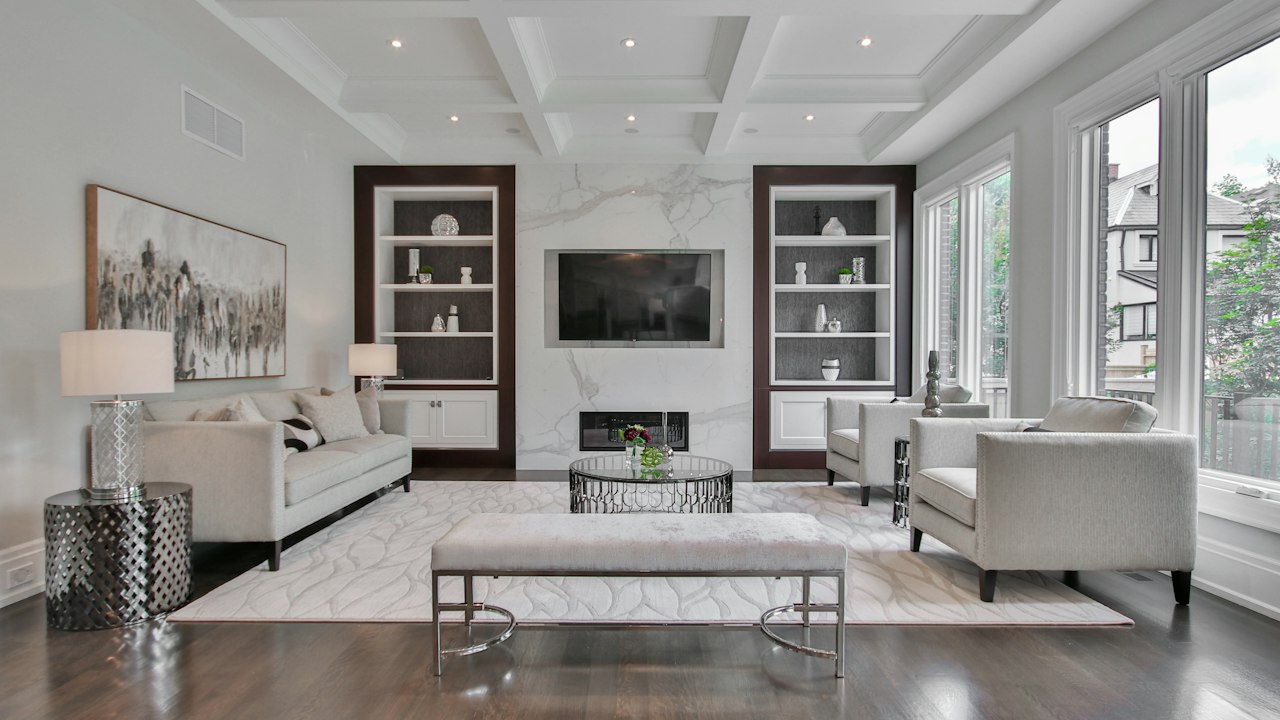
Understated blush pink. Gives bedrooms and dressing spaces an open, comforting glow that coordinates easily with grey and white.
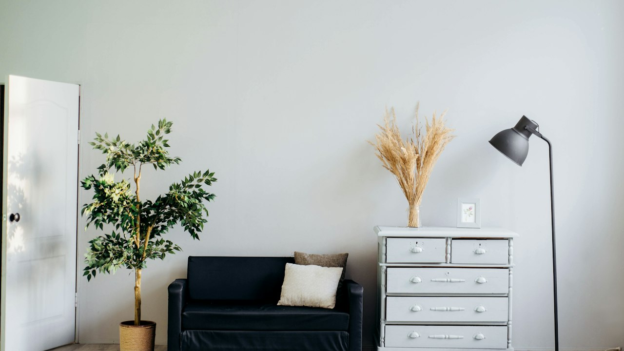
Classic architectural brick red. Sturdy and dignified on exterior walls, boundary pillars, and outdoor entertainment areas.
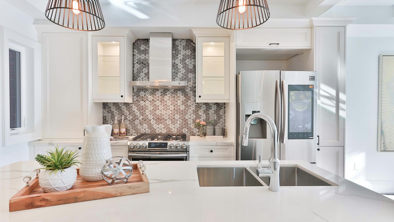
Deep subsoil red clay shade. Highly effective on exterior perimeter columns, boundary walls, and rustic commercial facades.
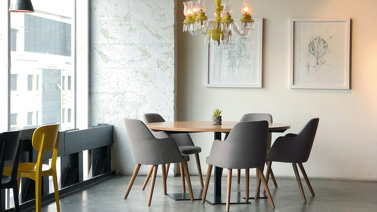
Rich, formal crimson red. Excellent for dramatic restaurant dining rooms, hotel bars, and opulent formal living rooms.
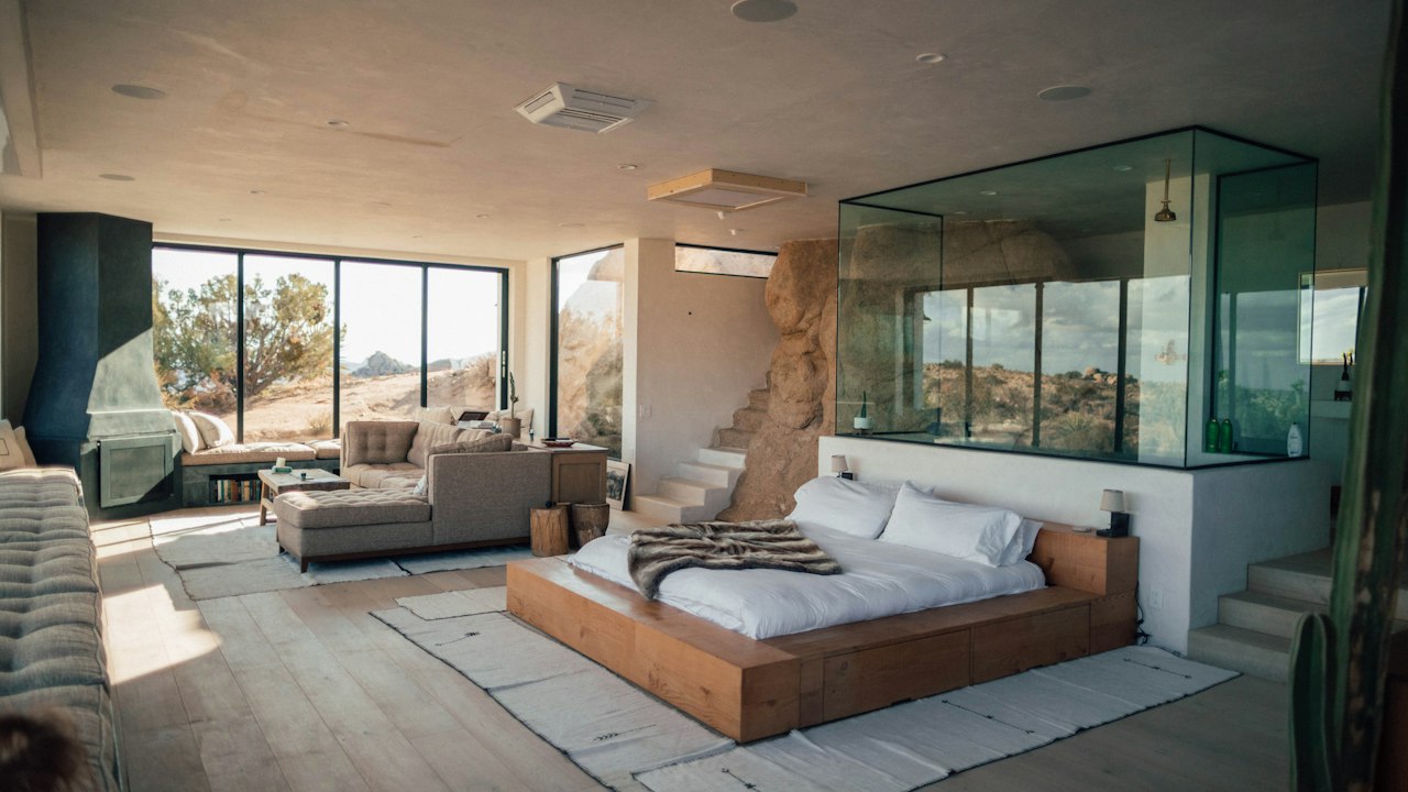
Deep, luxurious wine burgundy. Transforms home libraries, wine cellars, and executive boardrooms into distinguished spaces.
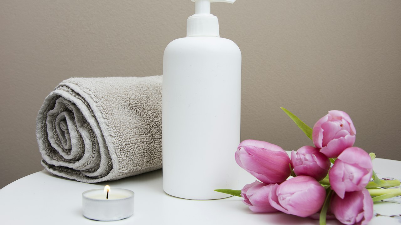
Gentle, soothing pastel lavender. Perfect for peaceful bedrooms, quiet reading corners, and wellness massage rooms.
Contemporary lilac-grey neutral. Adds subtle elegance to guest bedrooms, fashion boutiques, and modern living rooms.
Muted, smoky mauve. A stylish accent wall shade for boutique retail displays, beauty salons, and stylish home offices.
Opulent dark aubergine plum. Creates a magnificent, intimate focal point in luxury dining rooms, hotel suites, and formal powder rooms.
Bring any physical sample — a fabric swatch, tile, curtain, or corporate Pantone. Our computerised spectrophotometer measures the spectral reflectance curve and dispenses an exact formulation in minutes.
Practical advice on choosing, testing, and ordering architectural paint shades.
Consider the natural daylight in your rooms. East-facing rooms receive bright, warm morning sunlight, while west-facing rooms get warm afternoon glare. In Nairobi and highland areas, cool off-whites and greys balance bright light, while warm creams and earth tones bring warmth to rooms with smaller windows or shaded aspects.
The Sienna Paints Kenya palette comprises 100 reference shades numbered PK-001 through PK-100 across 10 families: Whites & Off-Whites, Creams & Sand, Greys & Charcoals, Browns & Earth Tones, Greens, Blues, Yellows & Ochres, Oranges & Terracottas, Reds & Pinks, and Purples. Each shade is formulated specifically for Kenyan architectural substrates and equatorial lighting.
Yes. All 100 shades can be computer-tinted into approved bases from Crown Paints (such as Crown Silk Vinyl, Crown Covermatt, Crown Weatherguard), as well as compatible bases from Duracoat, Plascon, and Sadolin upon request.
Digital screens display colours in RGB light, which can vary significantly depending on monitor calibration, brightness, and mobile display settings. We always recommend inspecting a physical fandeck swatch or testing a 1-litre on-site sample pot on your primed wall before ordering bulk batches.
Our tinting laboratory is located on Komarock Road in Kariobangi, Nairobi. You can bring any physical sample—such as a fabric swatch, tile, or existing paint chip—for instant spectrophotometer measurement and precision dispensing.
Yes. We encourage ordering 1-litre sample pots for any of our 100 shades. Applying two test coats on your actual primed plaster allows you to inspect the colour under morning, afternoon, and night LED lighting before full procurement.
Matt finishes diffuse light evenly and absorb glare, making colours appear slightly softer and truer. Silk and satin finishes reflect light, making shades look slightly brighter and more vibrant. High-sheen gloss paints make dark colours look deeper and richer.
Every tinted batch is formulated using automated computerized dispensers linked to stored spectrophotometer pigment curves. Whether you order Phase 1 today or Phase 2 three months later, the exact pigment-to-base ratio is replicated down to the millilitre.